

About
Webuild needed a new intranet for a global workforce of 35,000+ employees across multiple countries and business units, after rapid growth had left internal communications fragmented.
Challenge
The platform had to balance global consistency with local flexibility. Teams needed room to customise content, but the experience still had to feel like one coherent, credible Webuild platform inside the constraints of SharePoint.
Outcome
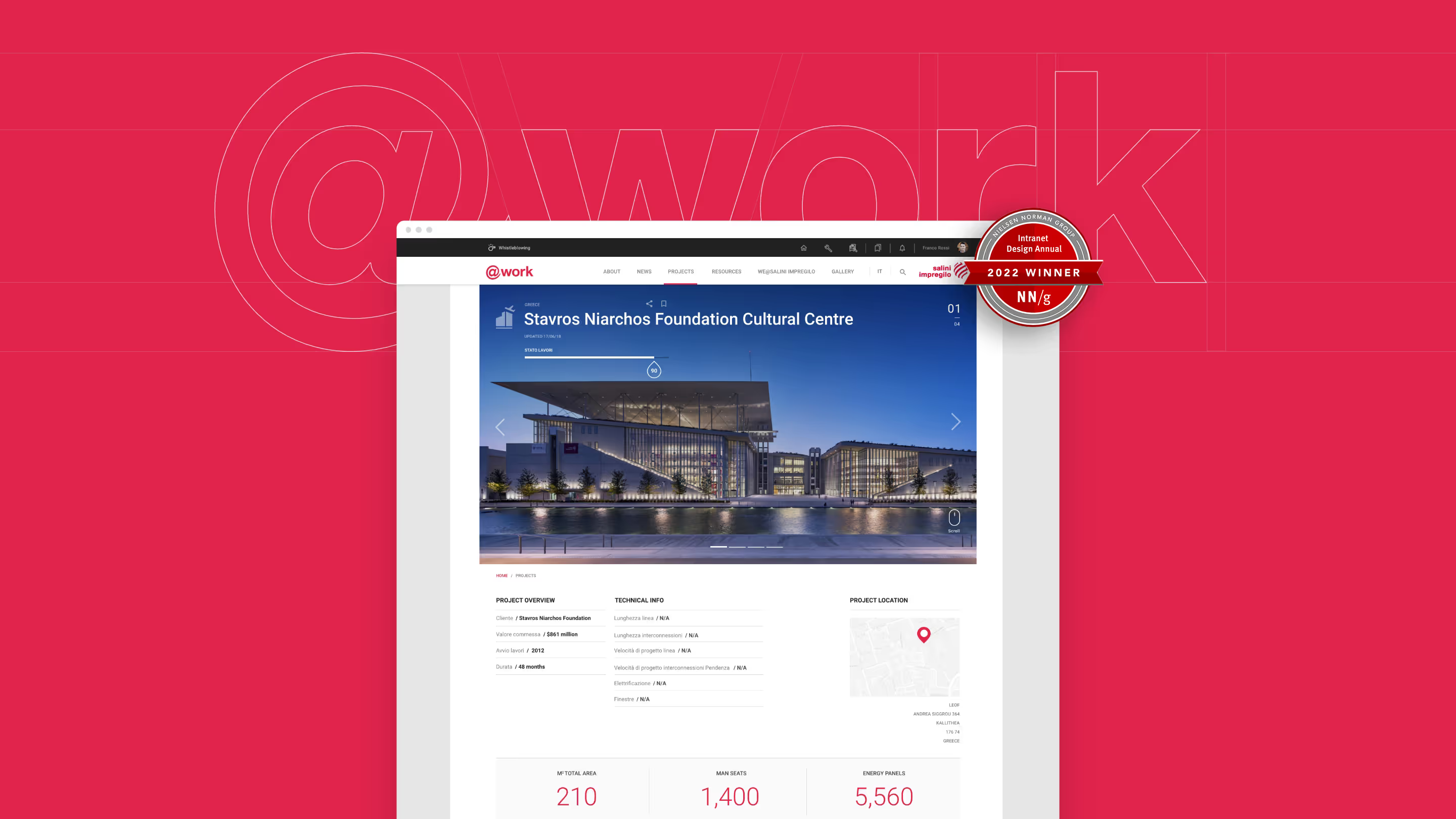
We created a modular visual system and light brand evolution that helped teams publish content more consistently while making the intranet easier to navigate, adapt and maintain. The platform went on to win Intranet Italia Champions Best Intranet 2021 and Nielsen Norman Group 10 Best Intranets of 2022.
Overview
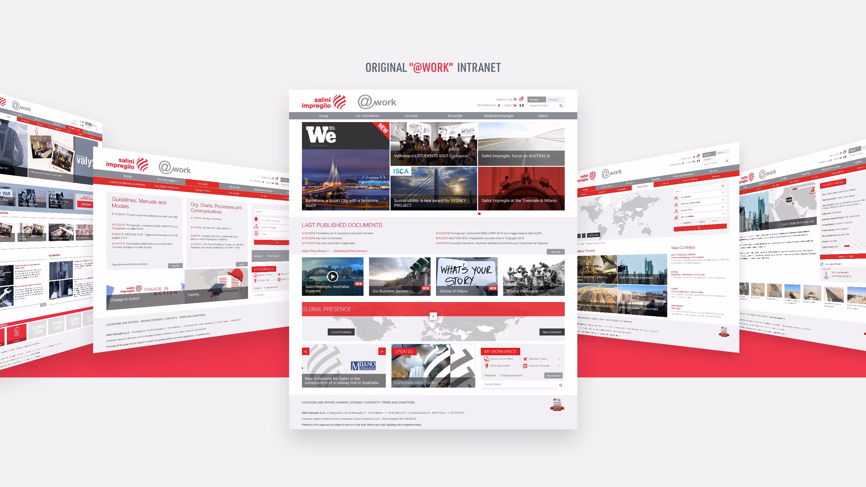
Webuild is a multinational construction and engineering group with over 35,000 employees across multiple countries and business units. Rapid growth had left internal communications fragmented, with inconsistent content, low engagement and limited visibility across the organisation.
The brief was to create an intranet that employees would trust and return to. It needed to be usable and structured, but also modern, credible and visually strong enough to shift perception of internal communications across the business.
Challenge
The challenge was balancing global consistency with local flexibility inside the constraints of SharePoint.
Different teams needed space to tailor content for their audiences, but the platform still had to feel coherent, navigable and recognisably Webuild.
My Role
I worked as part of a multi-agency team, partnering with UX, content and technical leads to shape the visual system around the wider platform strategy.
My role was to define modular templates, UI patterns and visual rules that could support different content types and publishing needs at scale. I also led a light evolution of the intranet brand, refining typography, colour, layout and interaction detail.
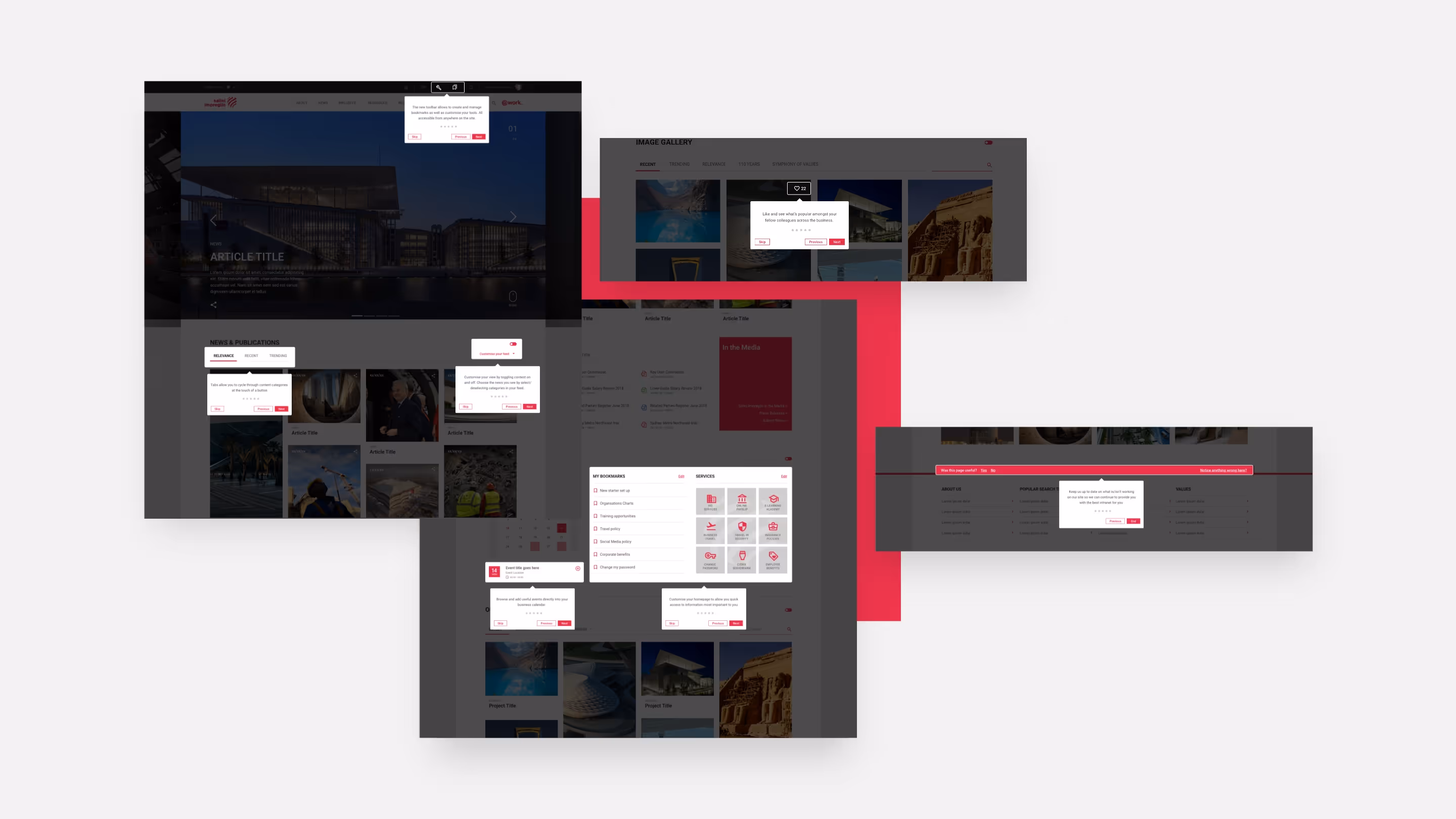
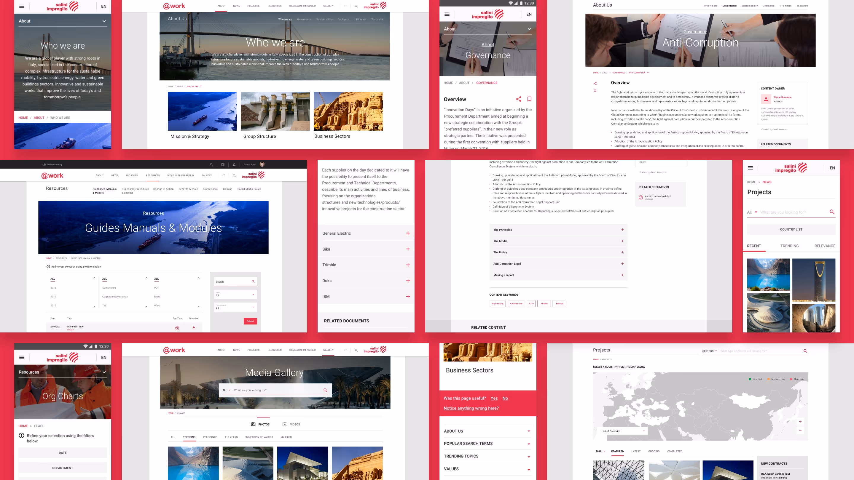
Design approach
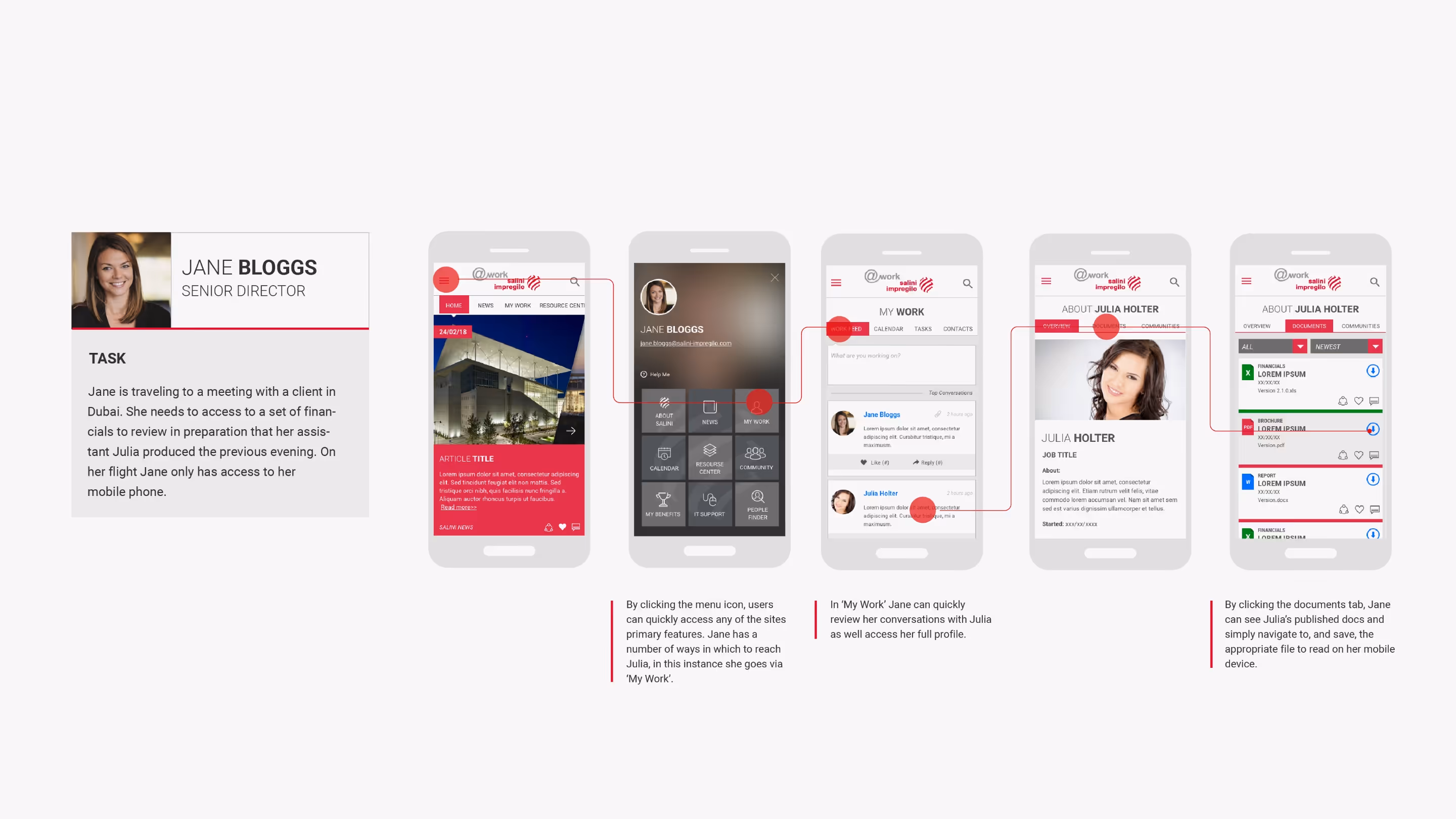
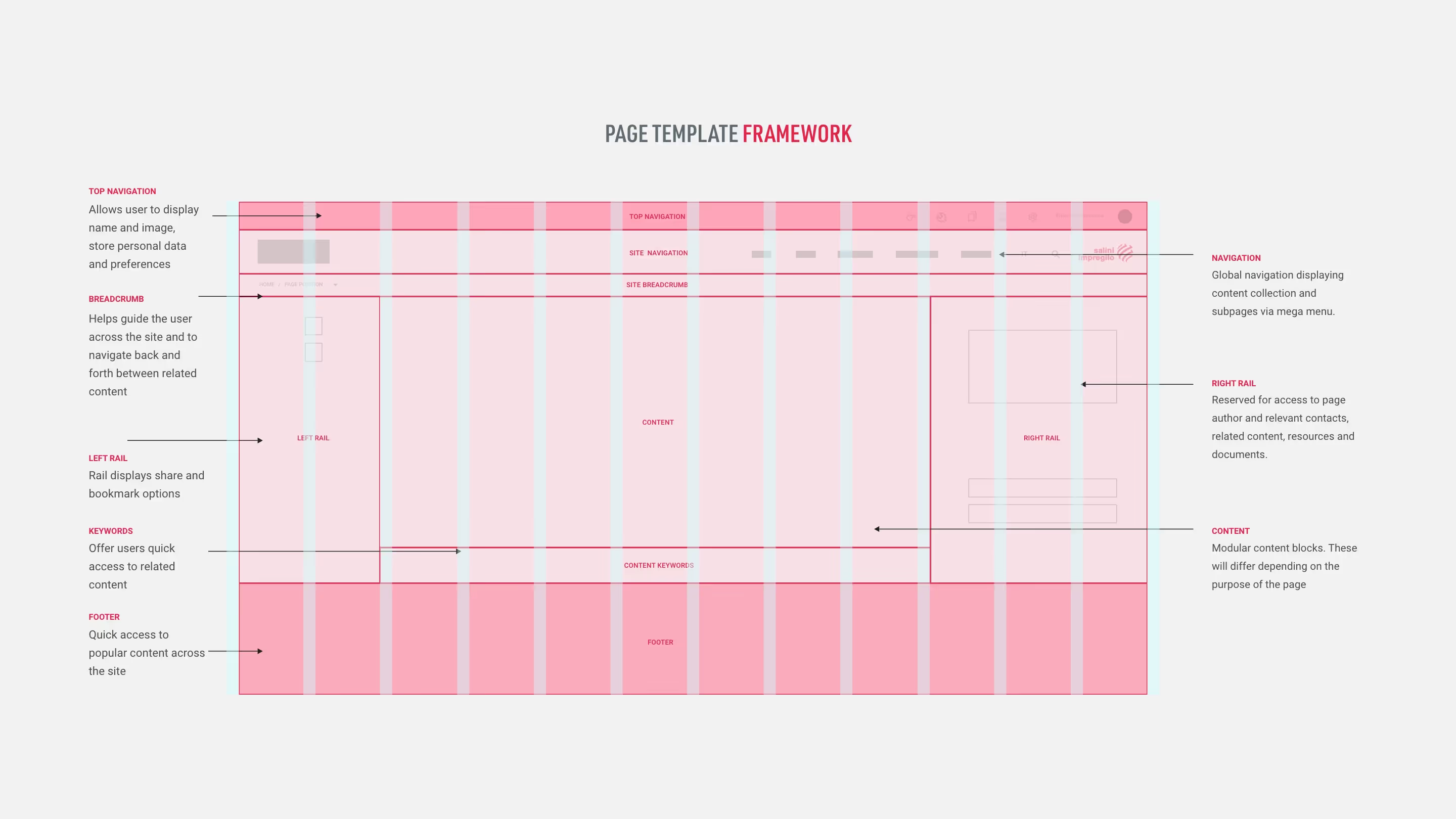
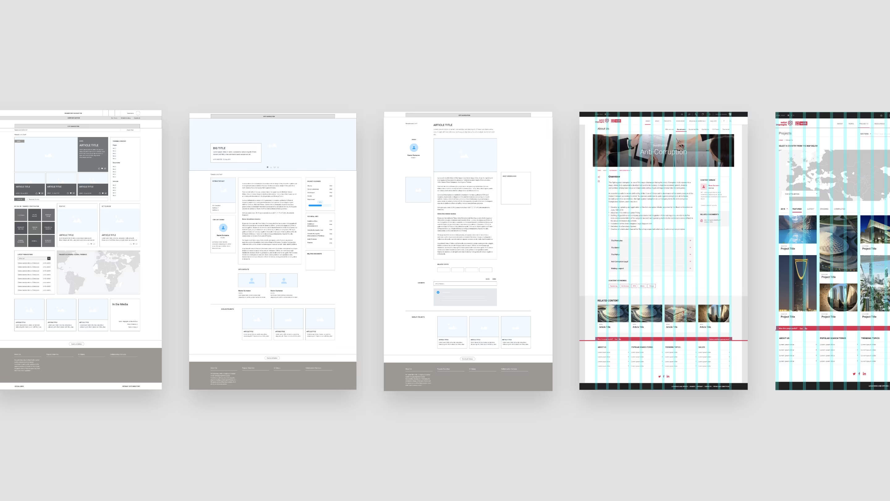
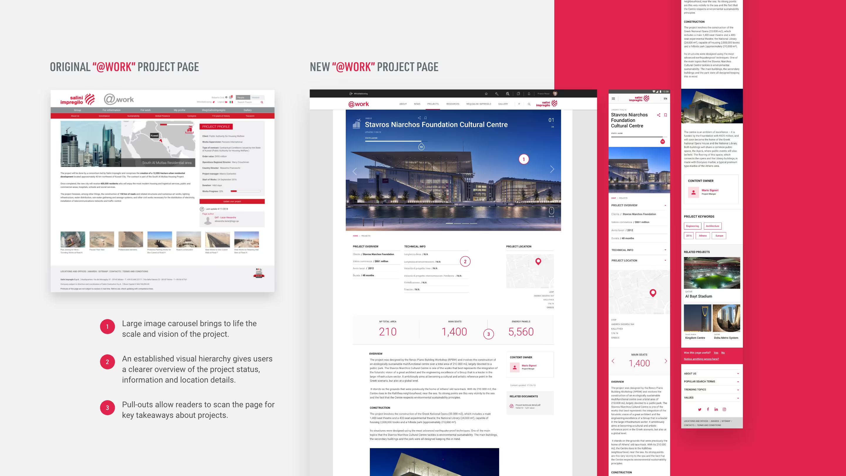
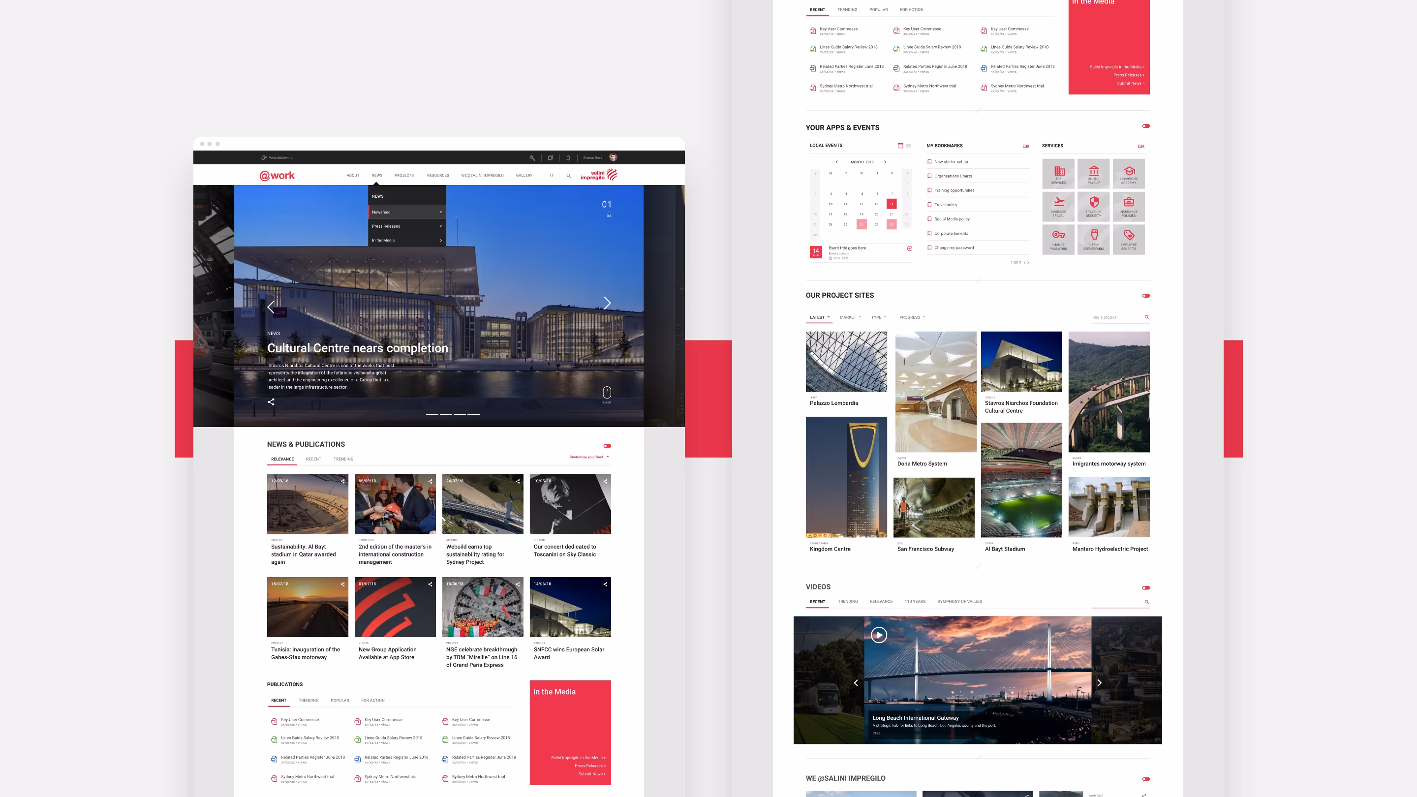
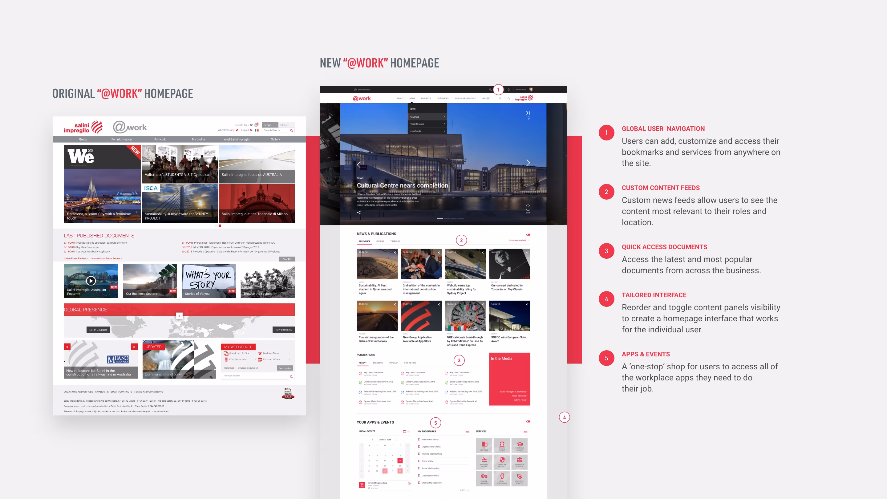
The work focused on creating a modular system. Templates and components were designed to support different content priorities while maintaining a clear, consistent hierarchy across the platform. Every design decision was tested against the idea: could local teams adapt this without breaking the wider system?
That approach gave teams enough flexibility to make content relevant to their audience, while keeping the intranet recognisably part of one global platform.
Designing within constraints
SharePoint created clear limits around layout, component behaviour and customisation.
Rather than treating those limits as blockers, the design focused on where consistency mattered most and where variation could safely happen. This helped the platform feel considered rather than templated, while still being realistic to build and maintain.

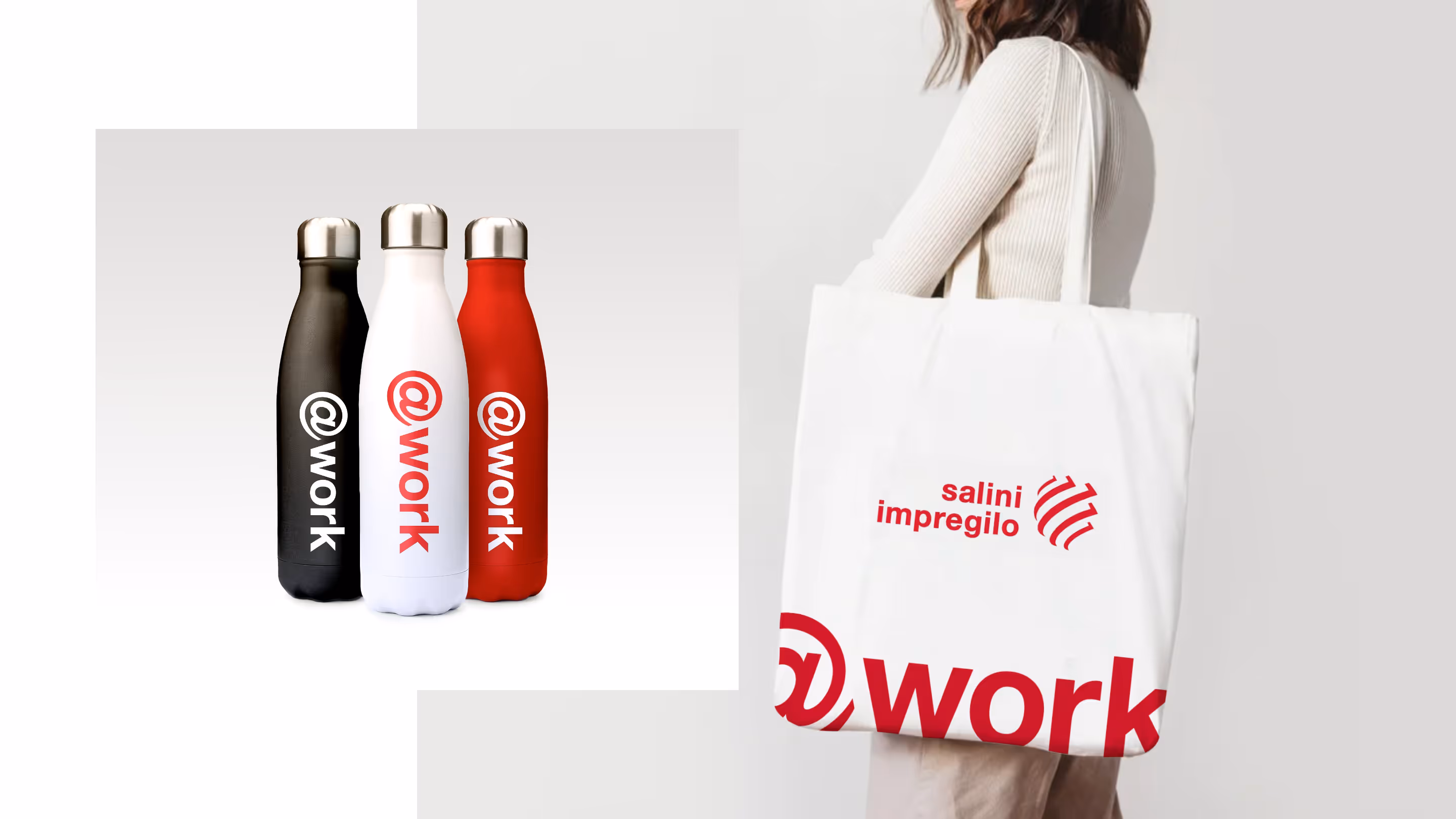
Brand and visual quality
Visual quality was treated as a trust signal. For a global workforce, the intranet needed to feel credible, current and worth returning to, not like a functional but forgettable internal tool.
The aim was not to create a separate brand. It was to make internal communications feel more organised, more confident and more recognisably Webuild.
Outcomes
The final platform gave Webuild a reusable visual system for publishing at scale. Different teams could adapt templates for their own content, while the intranet still felt like one coherent Webuild platform.
It was recognised with multiple industry awards, including Intranet Italia Champions Best Intranet 2021 and Nielsen Norman Group 10 Best Intranets of 2022. That recognition mattered because external validation was part of the client’s strategy to raise internal visibility and drive adoption.
Reflection
This project showed that visual design can influence how internal tools are perceived, especially inside large organisations where adoption can be hard to earn.
The work was not just about making the intranet look better. It was about making internal communications easier to manage, easier to trust and easier for employees to use every day.