

About
The San Francisco Giants’ home clubhouse at Oracle Park was redesigned during the 2025 offseason as part of a broader reset under new baseball leadership. The work covered the player journey from stadium arrival through the clubhouse and out to the field, using the environment to reinforce identity, expectation and team-first culture.
Challenge
The clubhouse had built up in layers over time, with previous updates added in isolation. Graphics, finishes and messaging lacked a clear system, creating visual clutter and mixed signals in a space meant to set the daily standard for players and staff.
Outcome
The redesign treated the clubhouse as a performance environment, not a decorative refresh. A cleaner visual language, stronger hierarchy, dimensional brand moments and a rebuilt championship threshold were used to turn the player route into a clear expression of standards, legacy and team identity.

Overview
A three-month redesign of the San Francisco Giants’ home clubhouse environment, completed during the 2025 offseason. The scope covered the full player journey from stadium arrival to the clubhouse and out to the field.
The goal was not to decorate the space. It was to reset the daily environment around standards, team identity and legacy, using the route players live every day.
Context + Brief
A new President of Baseball Operations wanted a visible shift in standard. The clubhouse was the right place to make that shift tangible because it frames the player experience before anyone reaches the field.
The brief was to create a cleaner, more intentional environment that reinforced team-first identity, made expectations visible and communicated that recognition inside the space had to be earned.
The Problem
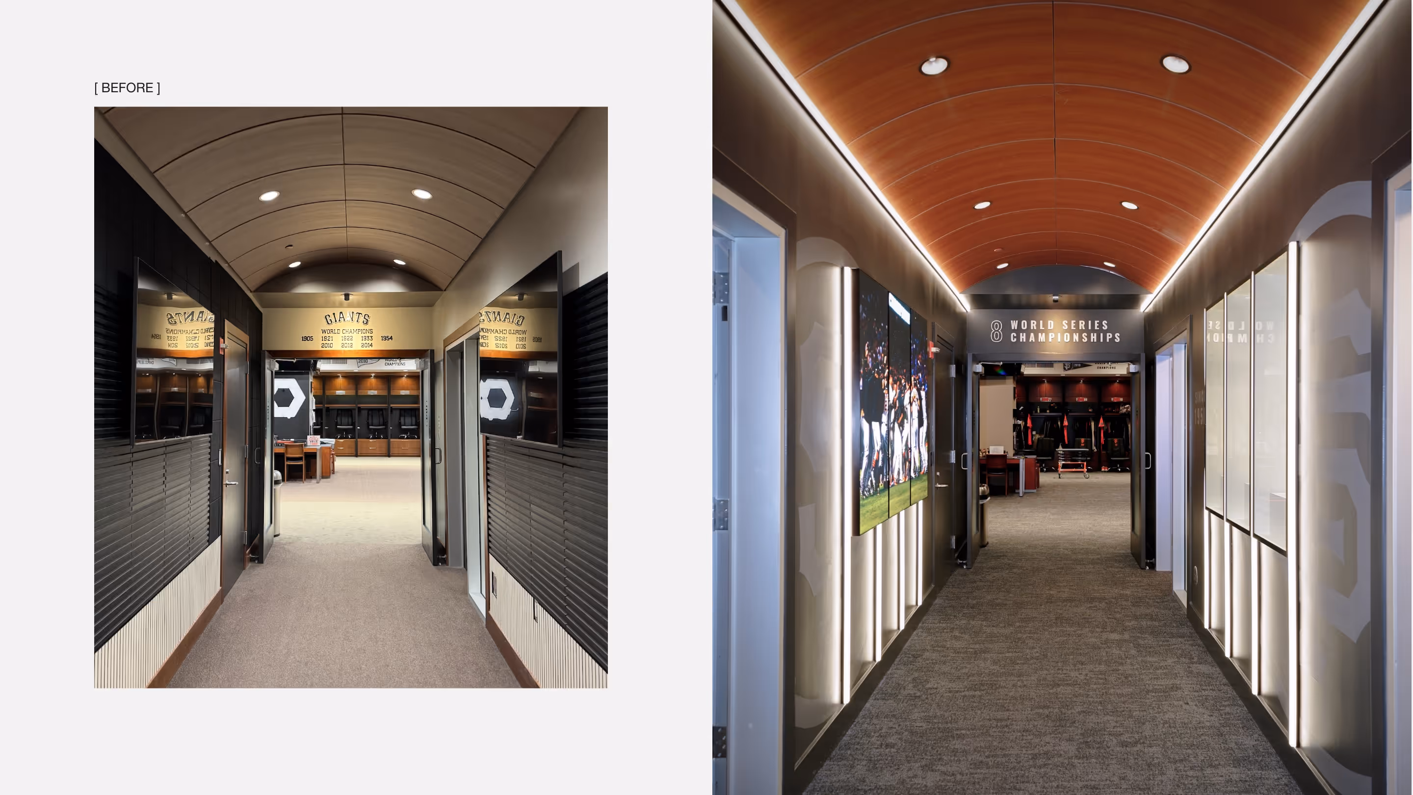
The clubhouse had built up in layers over time. Different leadership teams had added elements in isolation, staff had filled gaps with ad hoc updates, and a previous refresh had only been partially realised.
The result was visual clutter, mixed signals and no clear point of view. Finishes, graphics and moments of recognition existed, but they did not resolve into a coherent environment. The space had been layered, not designed.
Constraints
The project had to be delivered inside a three-month offseason window, with major work substantially complete before players returned for pre-season. Stadium upgrades were happening in parallel, fabricators were already stretched, and access to the clubhouse was tightly managed.
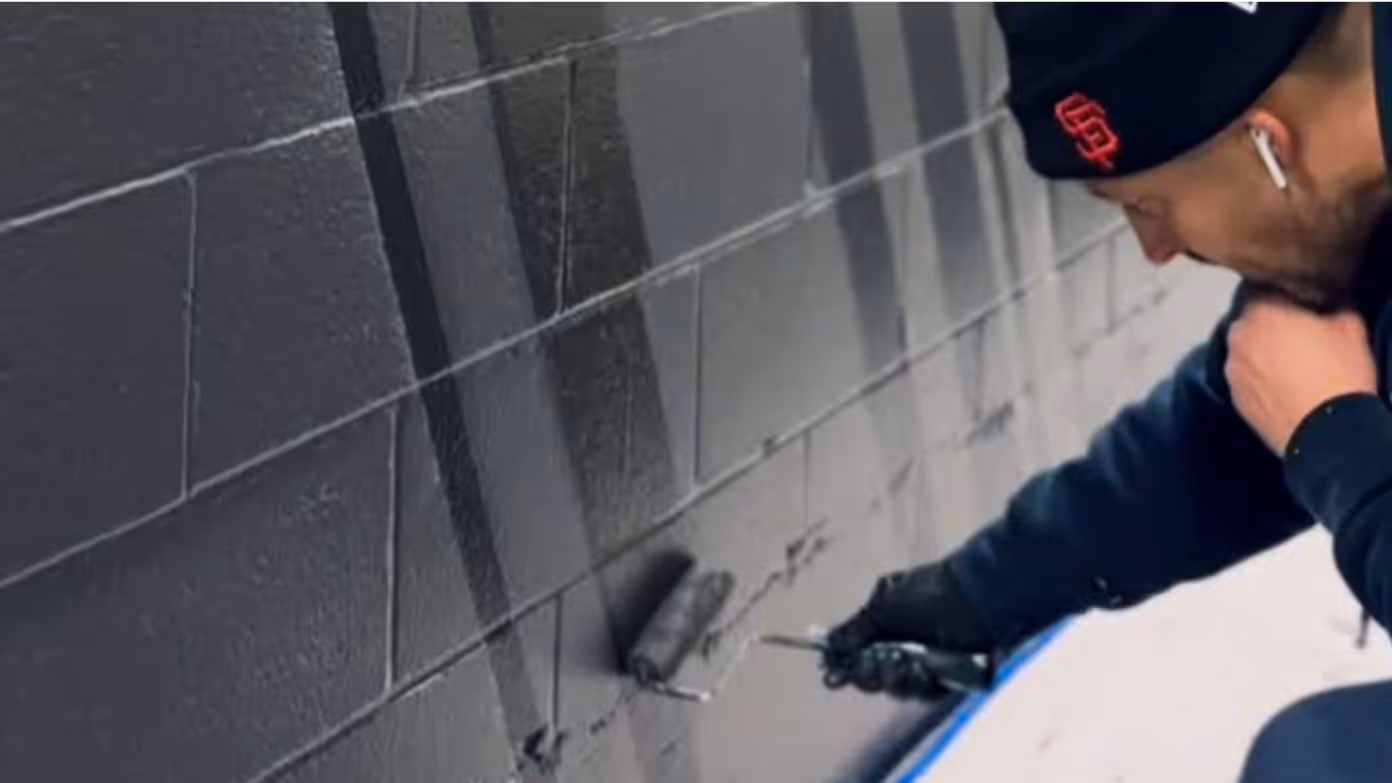
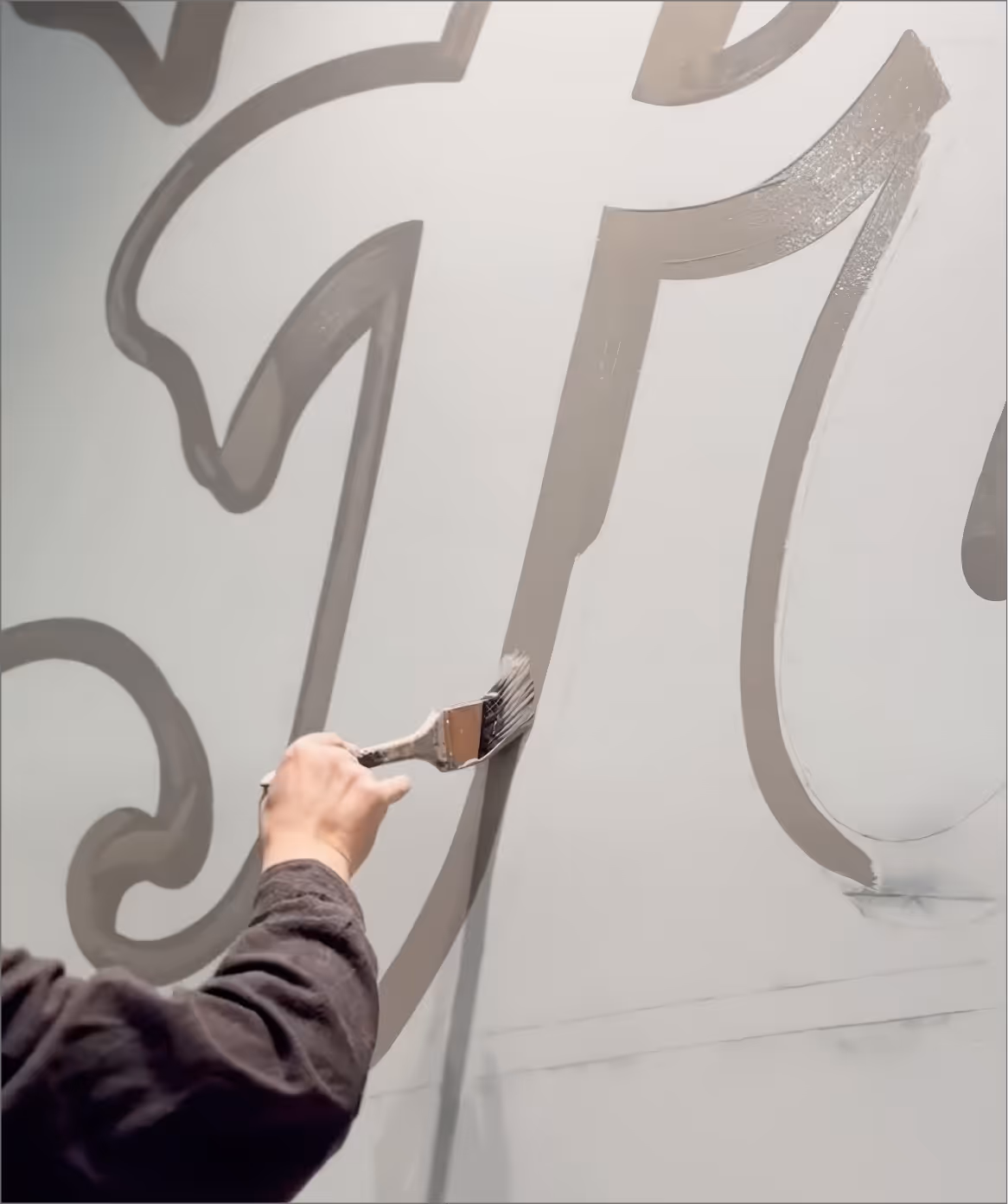
The build also combined several delivery types, including hand-painted graphics, dimensional fabrication, lighting, tension fabric and a secure trophy display. That meant the rollout had to be phased, with priority moments installed first and remaining elements completed as access allowed.
Roles + Responsibilities
I was the creative lead, owning the project from concept through delivery. My role covered the narrative framework, sequencing across the player journey, design of each touchpoint, stakeholder presentations and coordination with fabricators and architectural partners.
Approvals ran directly through the President of Baseball Operations and Head of Ballpark Operations, so the work had to hold both cultural intent and operational practicality.

Strategy
The concept was treated as a player journey, not a series of isolated upgrades. Before making design decisions, the priority was to define what the space needed to communicate each day. From there, the work focused on stripping back visual noise, creating a more deliberate design language, and shaping the moments players passed on their route from arrival to the field.
Design Moves
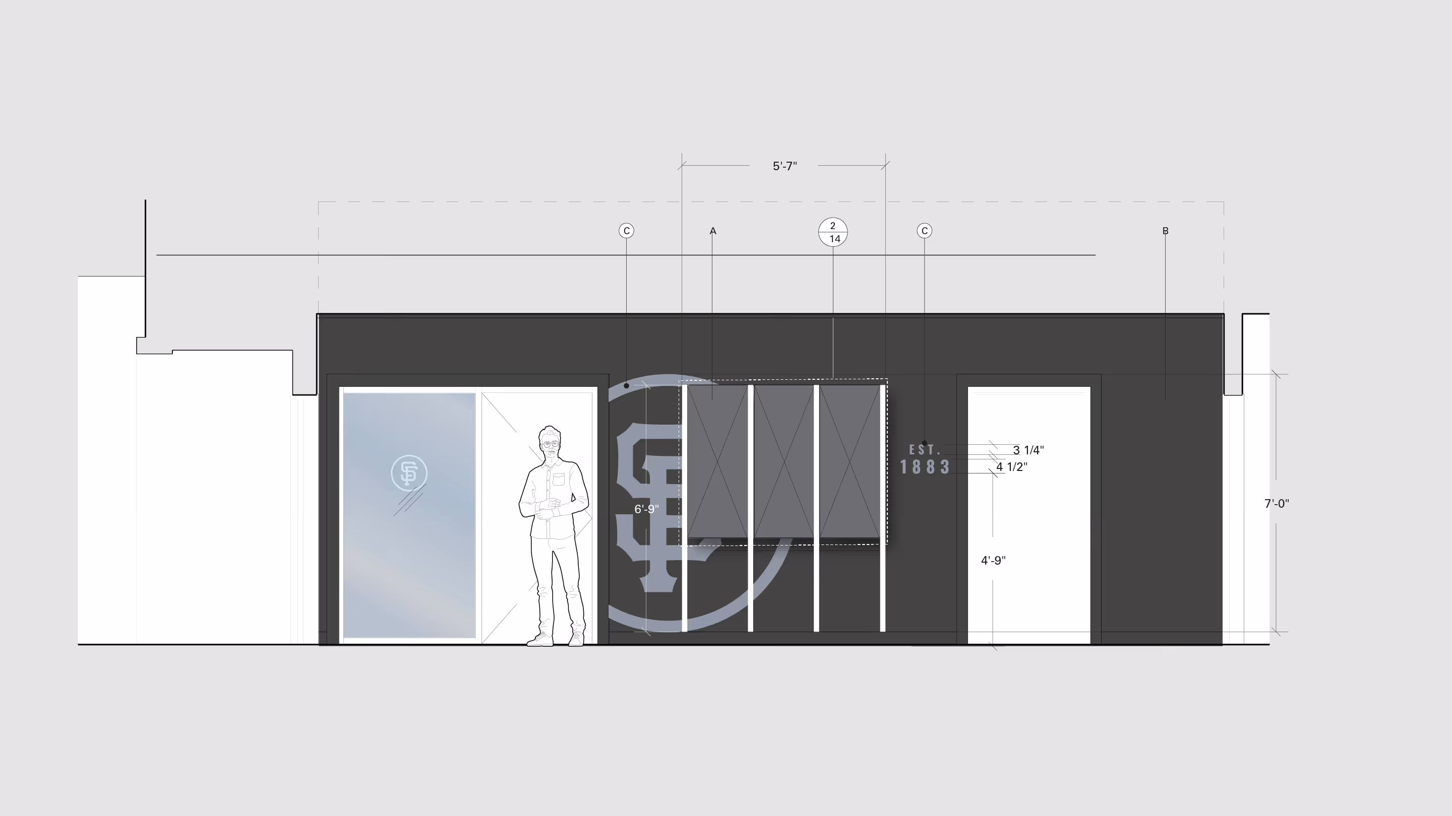
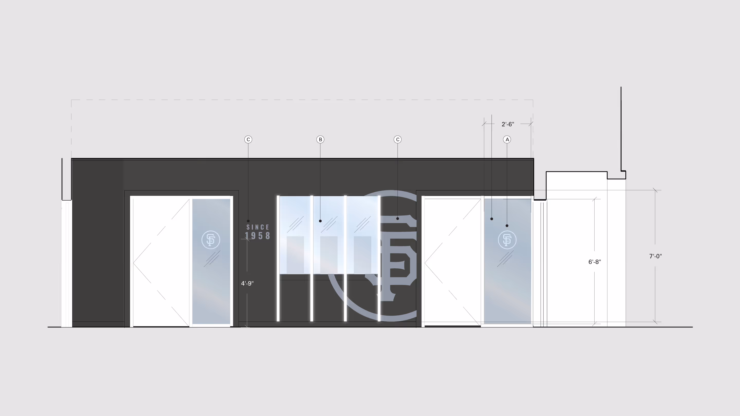
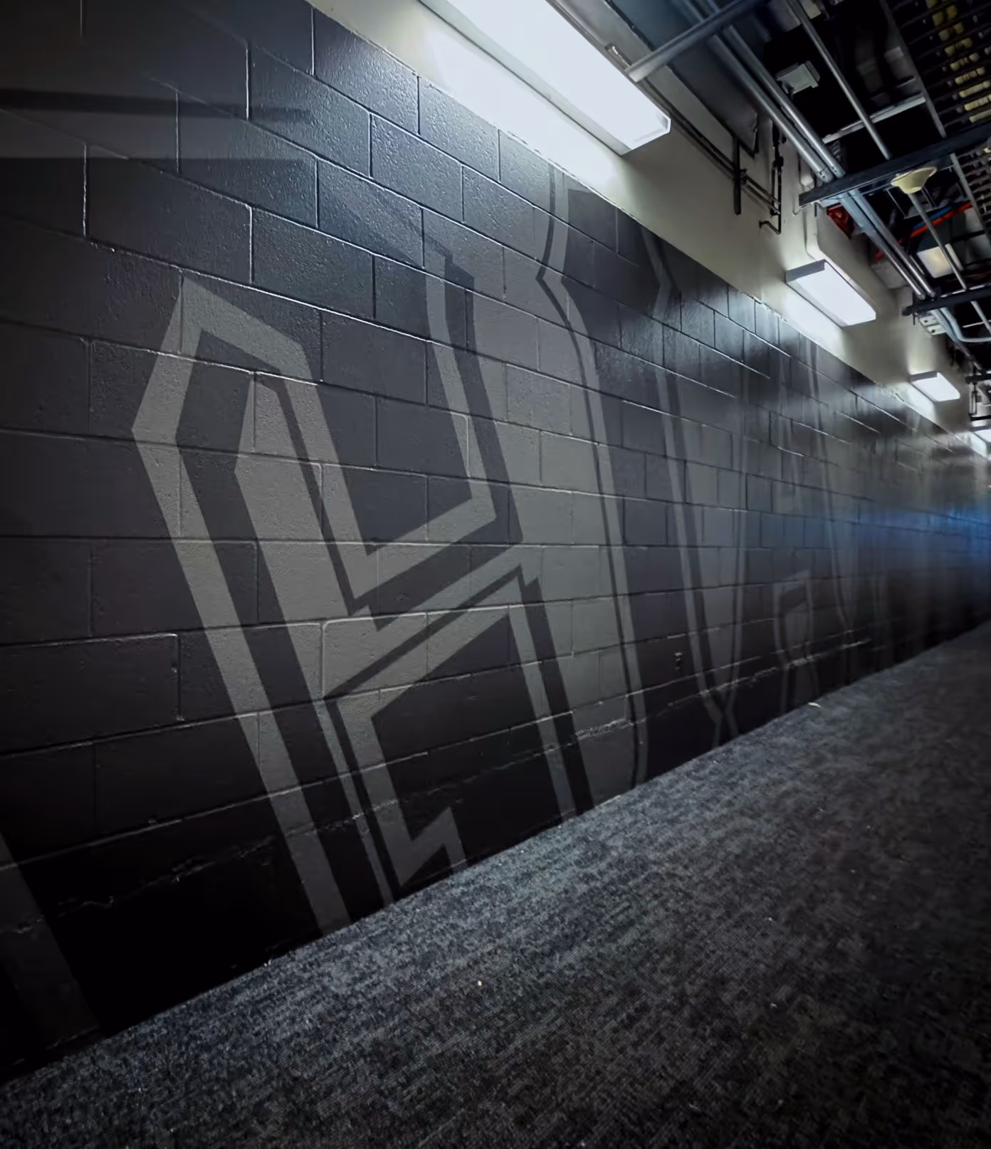
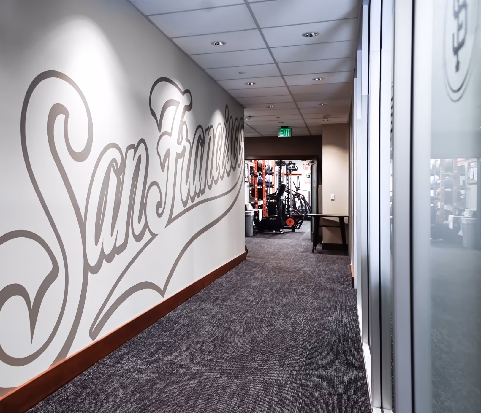
The design brought the clubhouse into one coherent environmental language, using type, surfaces, lighting and hand-painted artwork across the full player route.
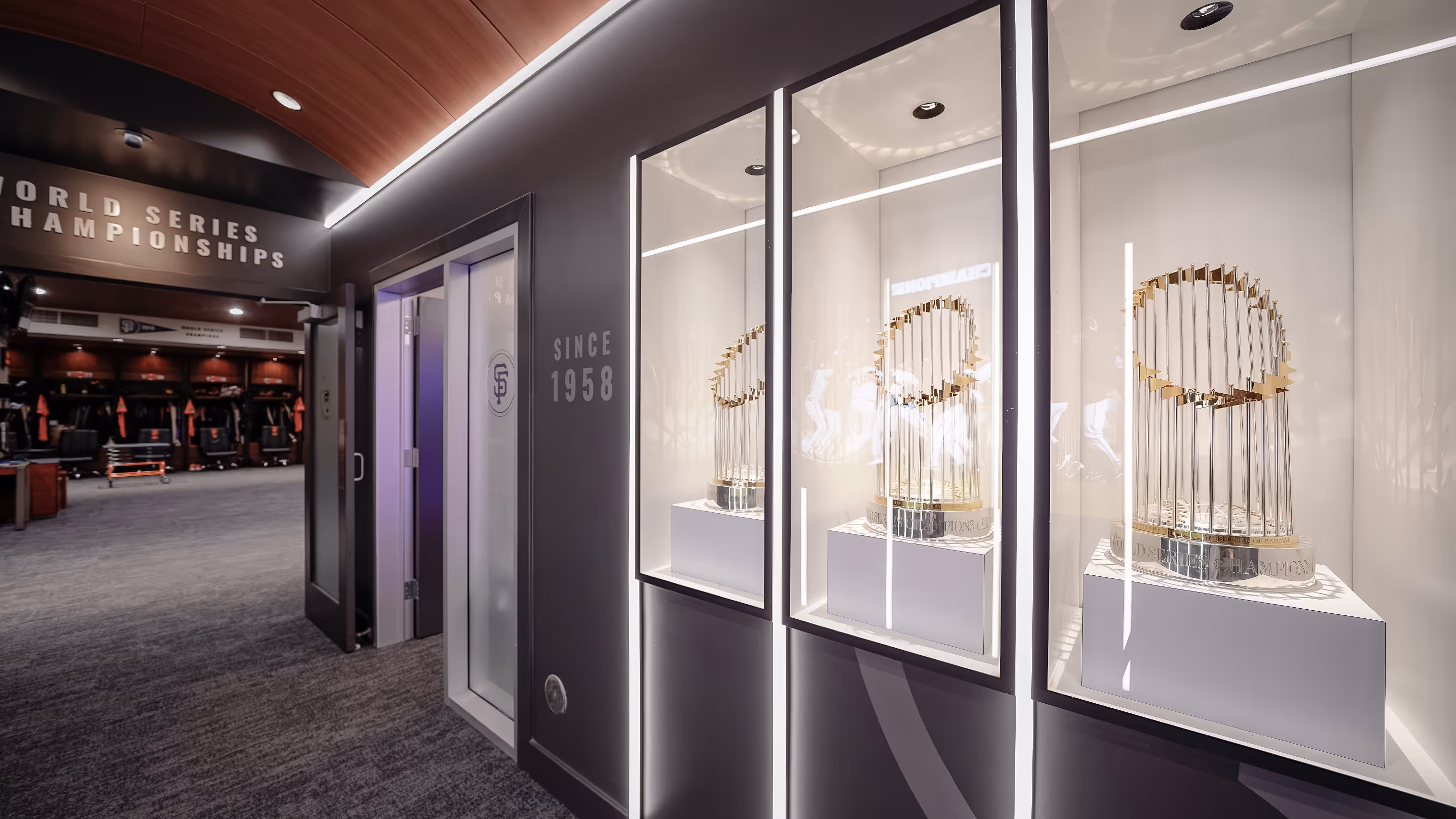
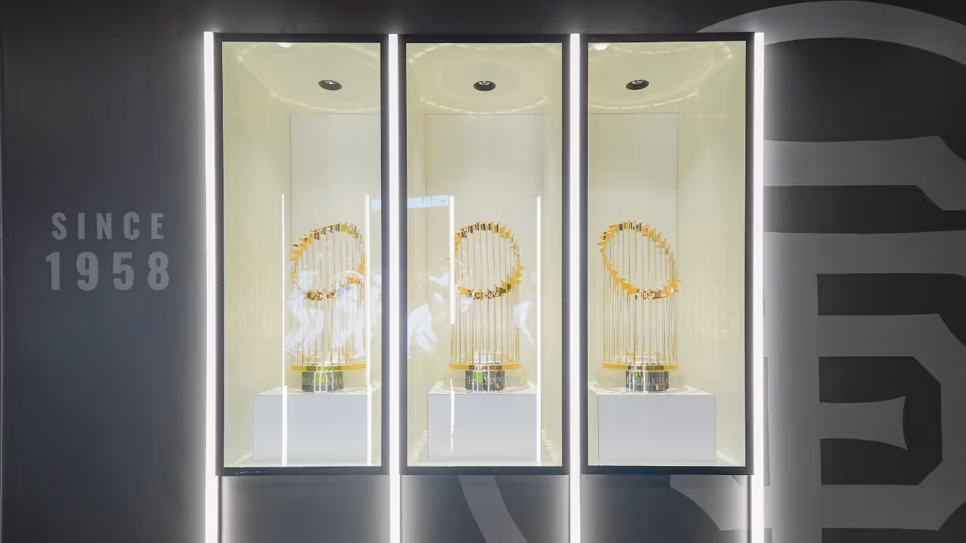
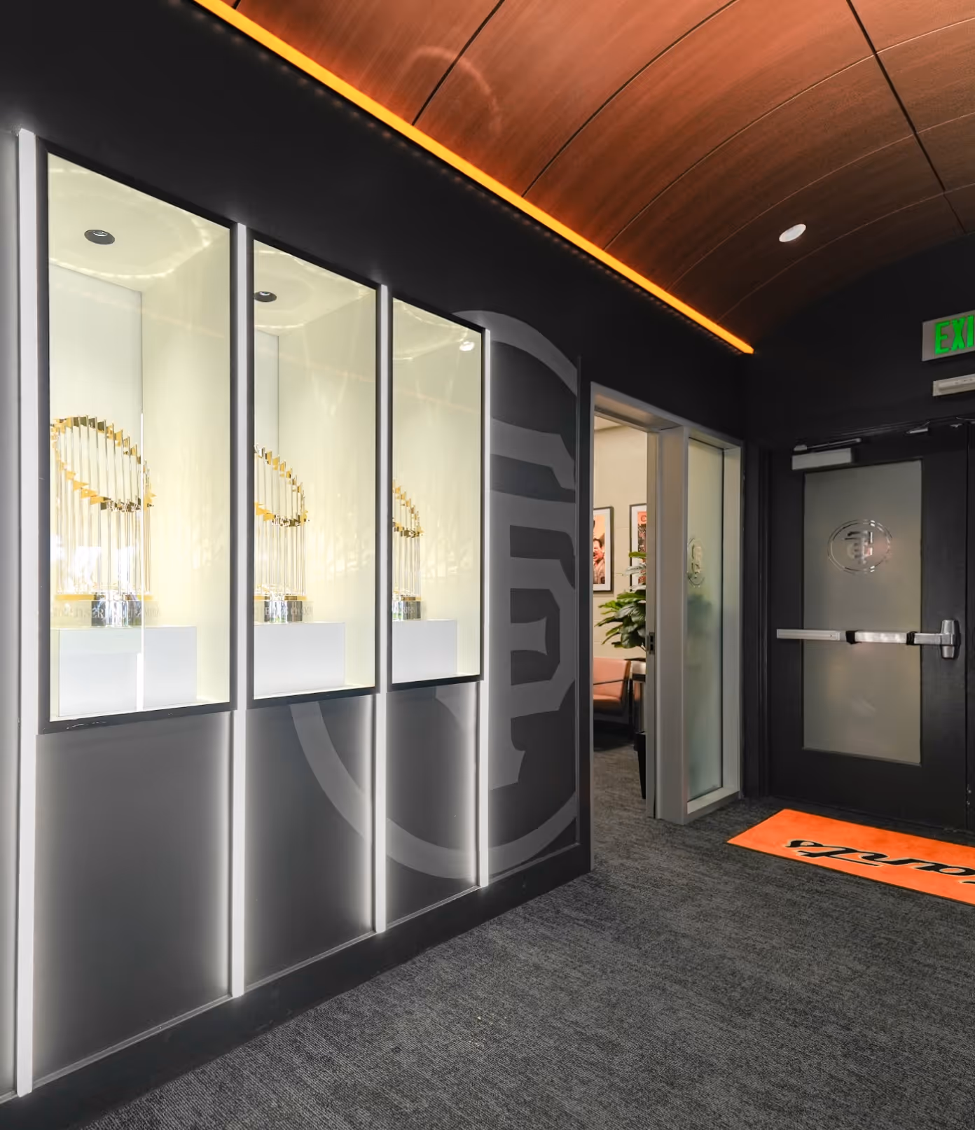
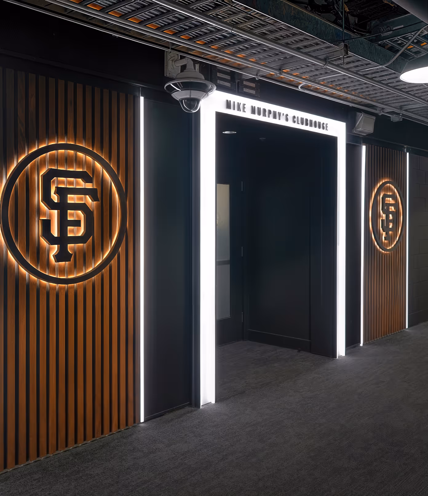
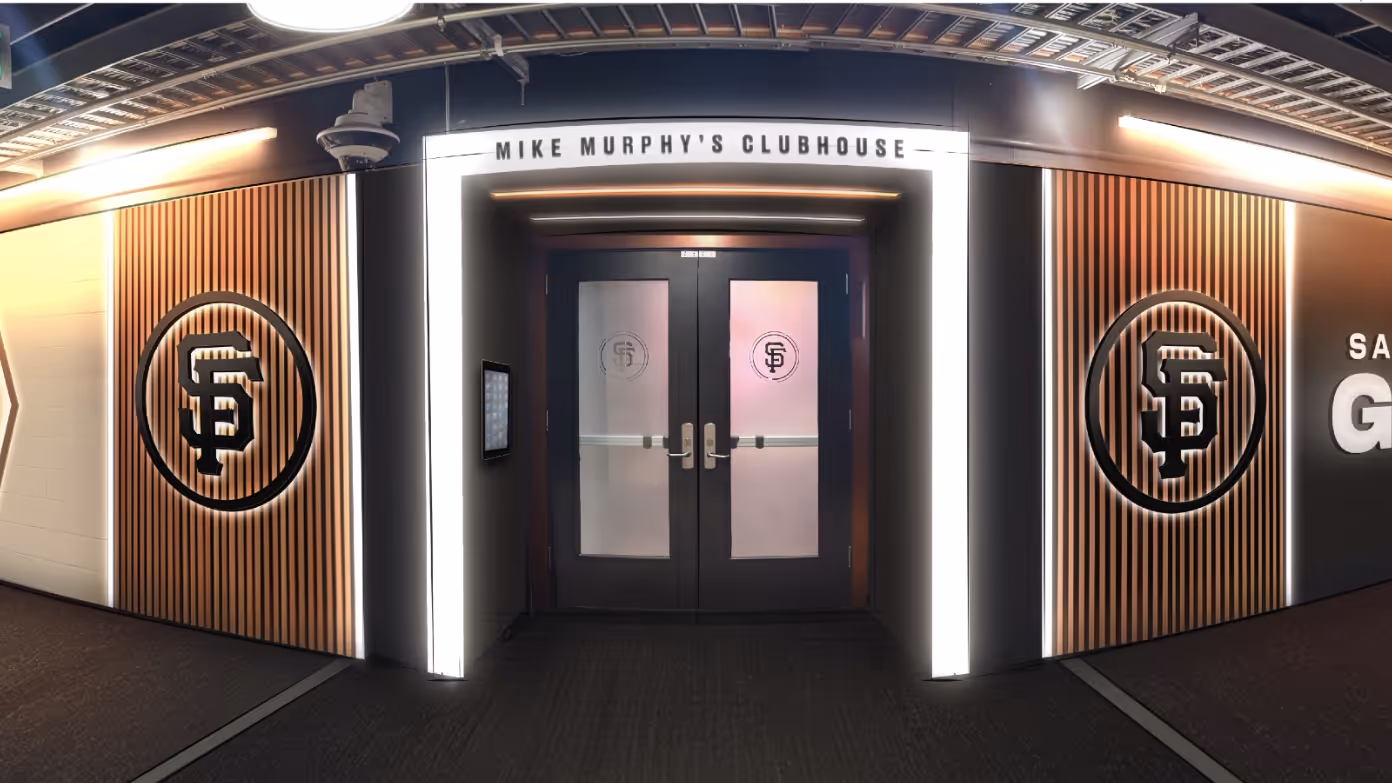
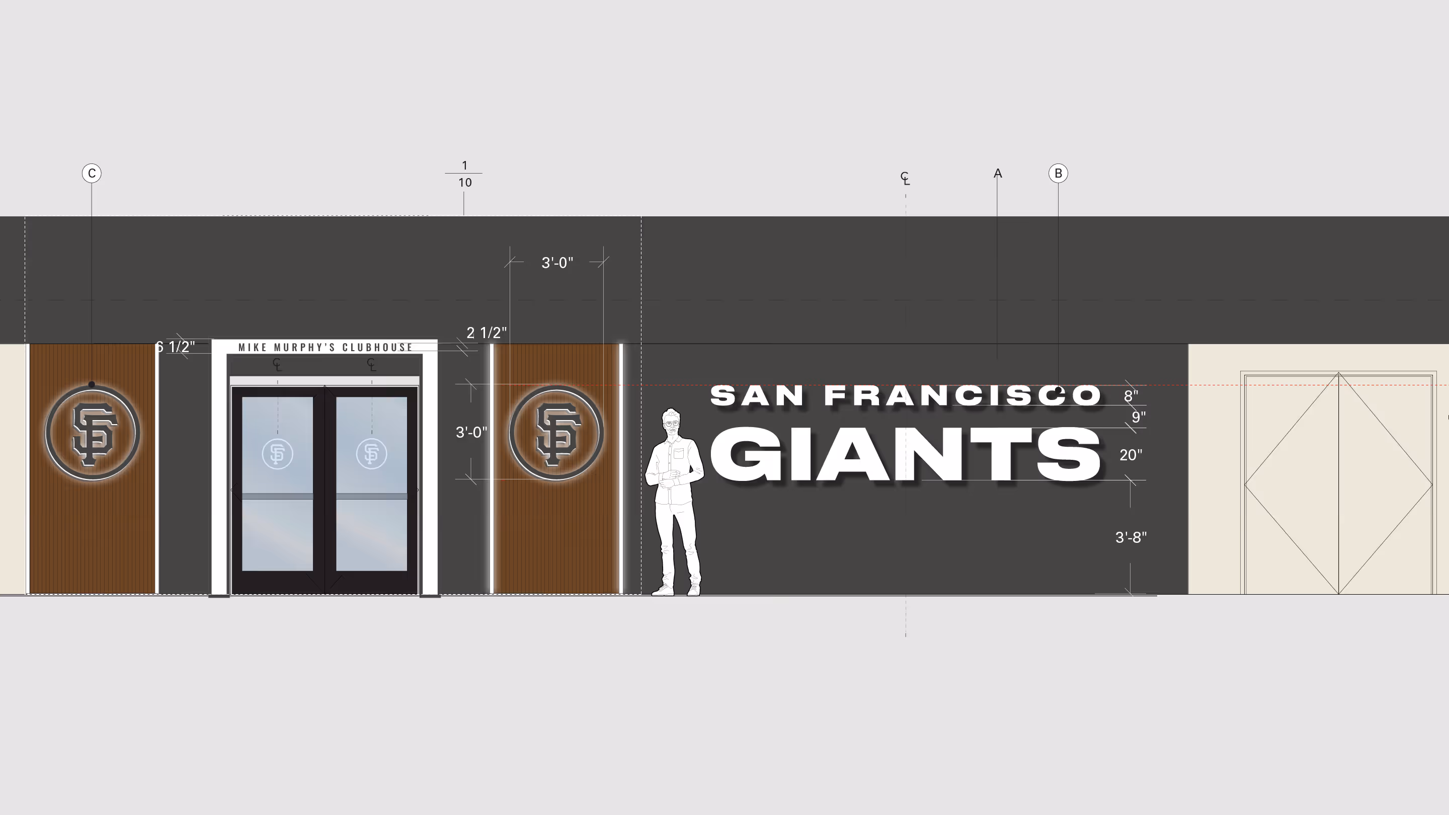
Legacy was made more visible and intentional. The clubhouse entrance was renamed for Mike Murphy, retired Giants Clubhouse Manager, while the team’s three World Series trophies were placed in a custom secure wall at the entrance, making the organisation’s standard impossible to miss.
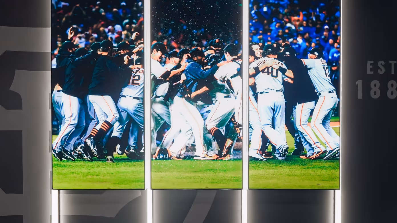
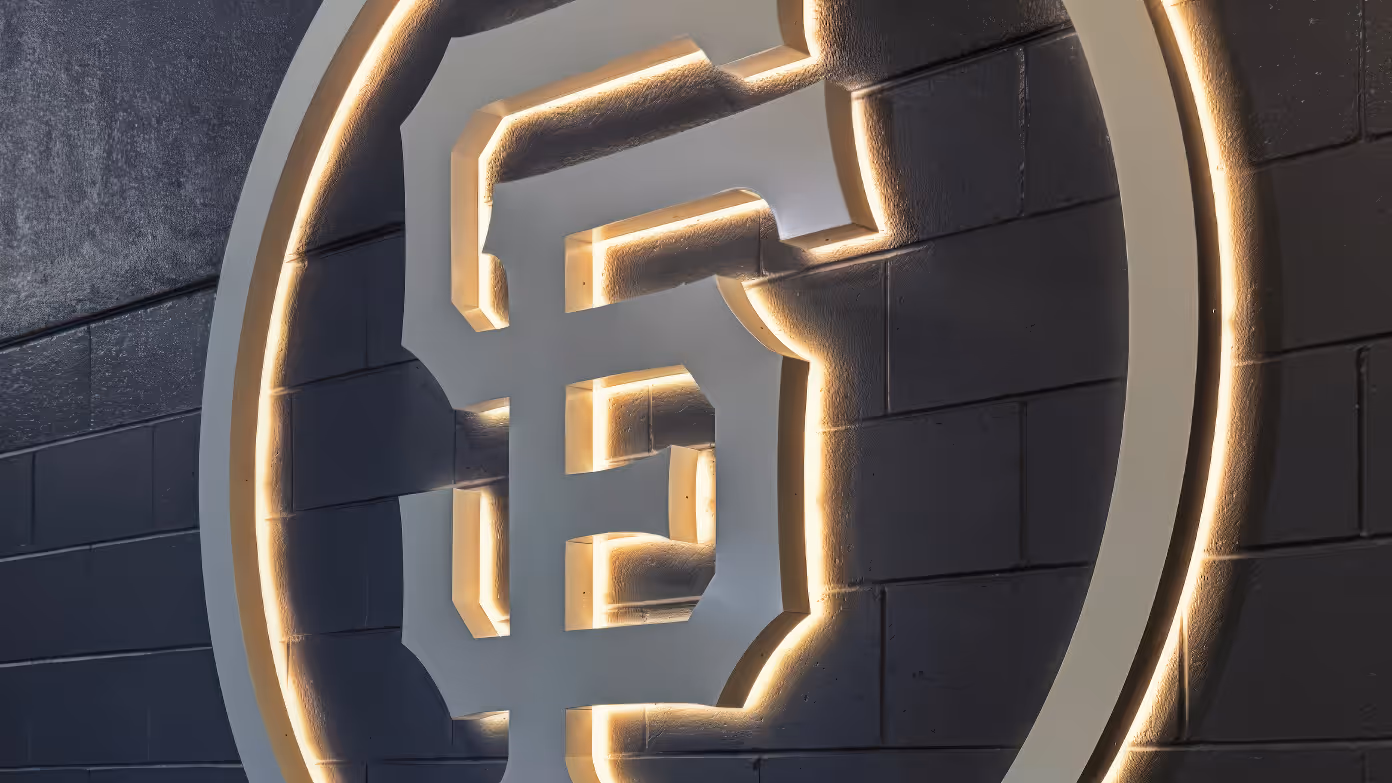
Graphics became architectural moments. Dimensional type, backlit marks and integrated lighting helped structure the route, while championship imagery added context and emotion around the trophies.
Reflection
The project showed that a player environment can do more than display history. It can set expectations, shape daily rituals and make the organisation’s standards visible before anyone reaches the field.