About
The Giants Dugout Store is the San Francisco Giants’ flagship retail space at Oracle Park. Open year-round from the street and connected to the ballpark on gamedays, it has to work as both a commercial destination and part of the stadium arrival experience.
Challenge
The store had to balance shopping, crowd movement, stadium access and Giants brand storytelling inside a fixed footprint. The existing layout created overlapping flows, loosely defined routes and moments where staff had to manage congestion manually.
Outcome
The redesign treated the store as a live venue system. Entry, exit, product zoning, checkout and brand storytelling were shaped around how fans moved, creating a clearer retail experience where Giants identity, gameday operations and commercial needs worked together rather than competing for space.
Overview
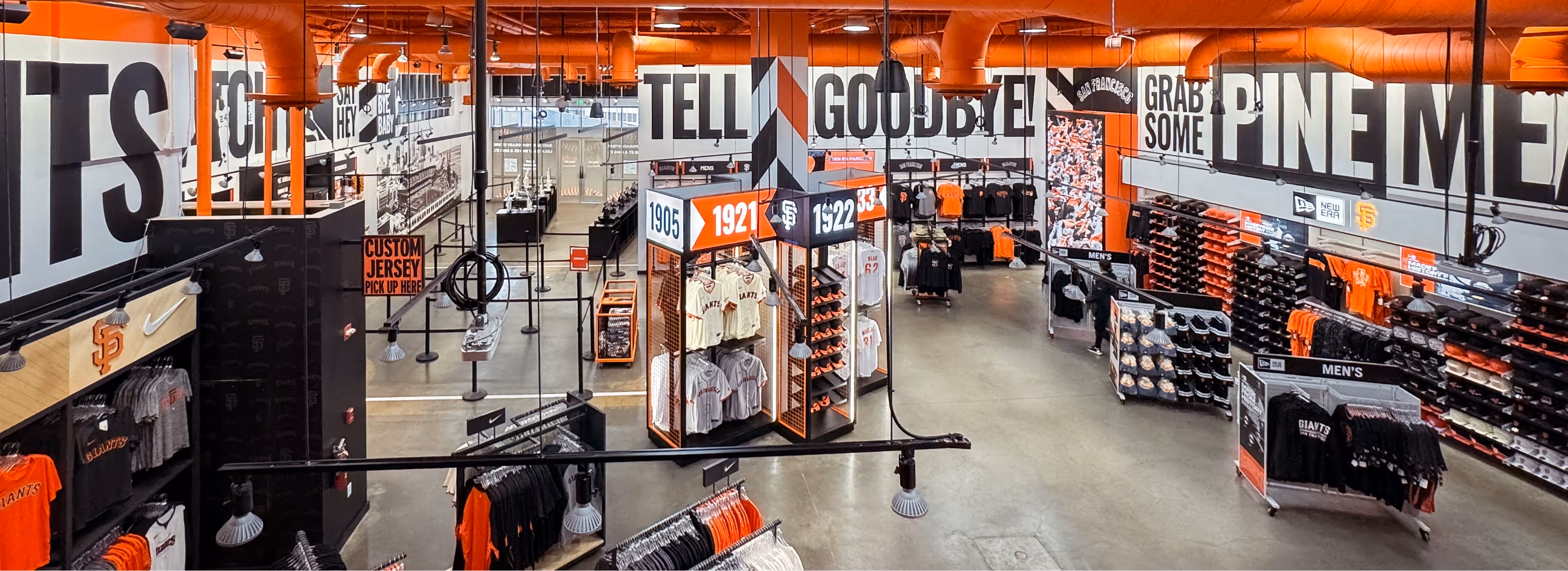
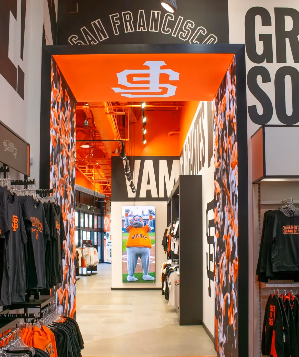
The San Francisco Giants’ flagship Dugout Store sits on the outer façade of Oracle Park. It is open to the street year-round and, on gamedays, also acts as a major entry route into the stadium.
That made it more than a standard retail project. The store had to balance shopping, crowd movement, stadium access and Giants brand storytelling under live gameday pressure.
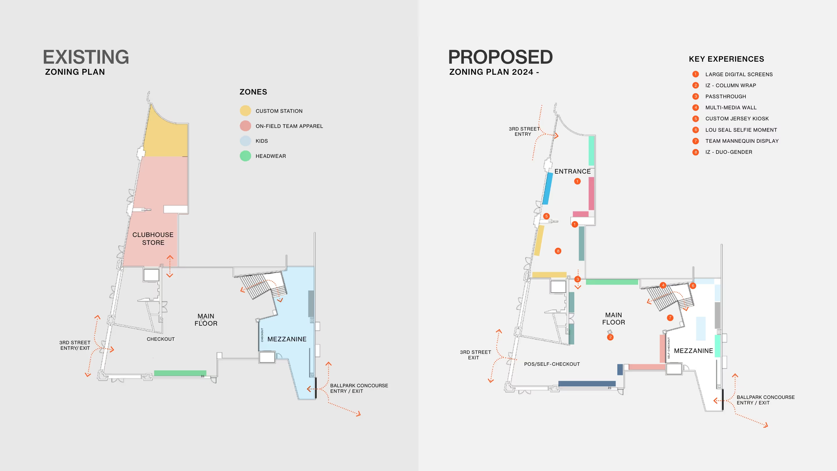
Historically, the space behaved like a regular team store. Entry and exit flows overlapped, decision points were unclear, and staff often had to step in to manage congestion. The problem was not just how the store looked. It was how it performed when full.


Context & Framing
This was not a blank-sheet redesign. The footprint was fixed, Opening Day was set, and the store had to work for very different behaviours at once, from tourists browsing to fans moving quickly towards first pitch.
The challenge was to balance shopping, crowd movement, stadium access and Giants brand storytelling under live gameday pressure. Historically, the space behaved like a regular team store, with overlapping entry and exit flows, loosely defined routes and congestion that staff often had to manage manually. The issue was not just how the store looked, but how it performed when full.
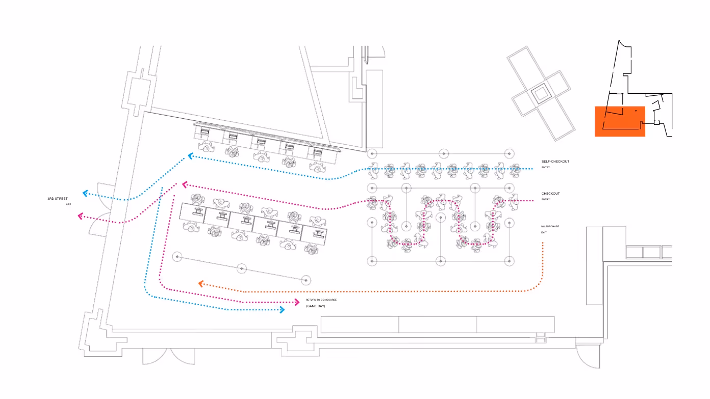
Designing a Layout Around Movement
Within the fixed shell, we introduced a new entrance and turned the original street opening into a dedicated exit. Separating ingress and egress gave Operations clearer control of capacity and stopped opposing flows from building inside the store.
The layout was then organised around pace. Fast-moving routes carried fans toward the stadium, while slower browsing zones sat deeper in the plan. High-throughput categories were brought forward, helping the store support both gameday movement and retail intent without one compromising the other.
Designing the System
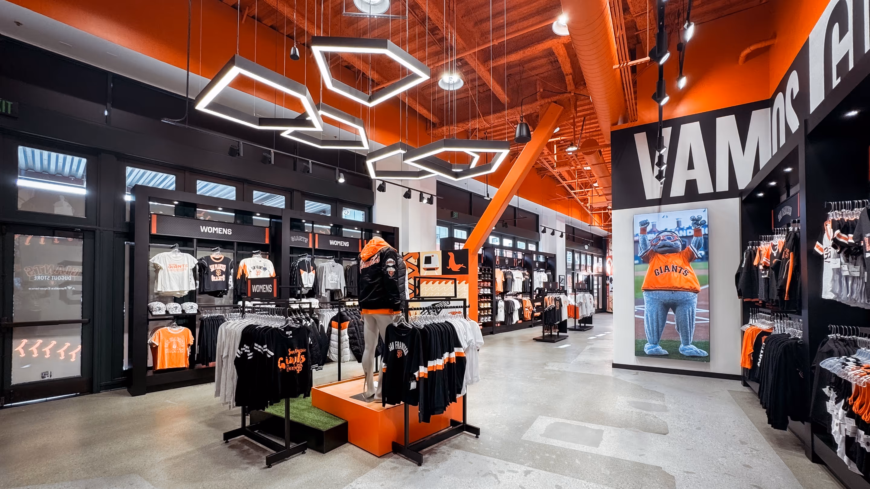
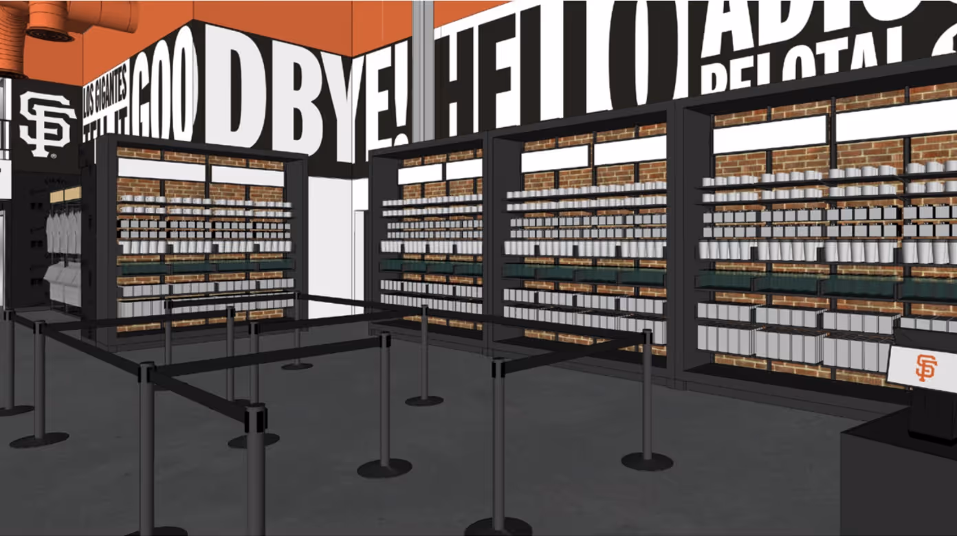
The store was designed around predictability, legibility and brand restraint. Sightlines were kept open, fixture heights were controlled, and product zones were made easier to understand without relying on extra signage.
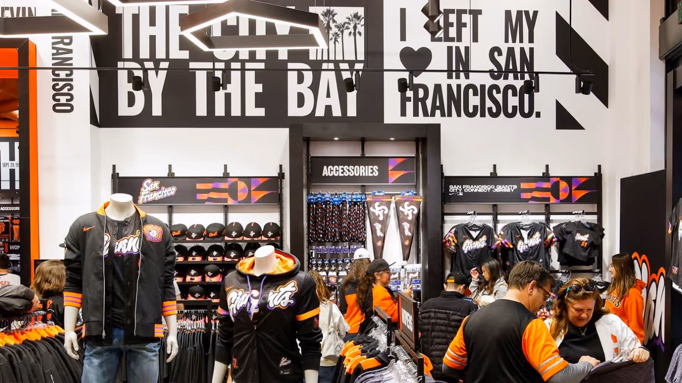
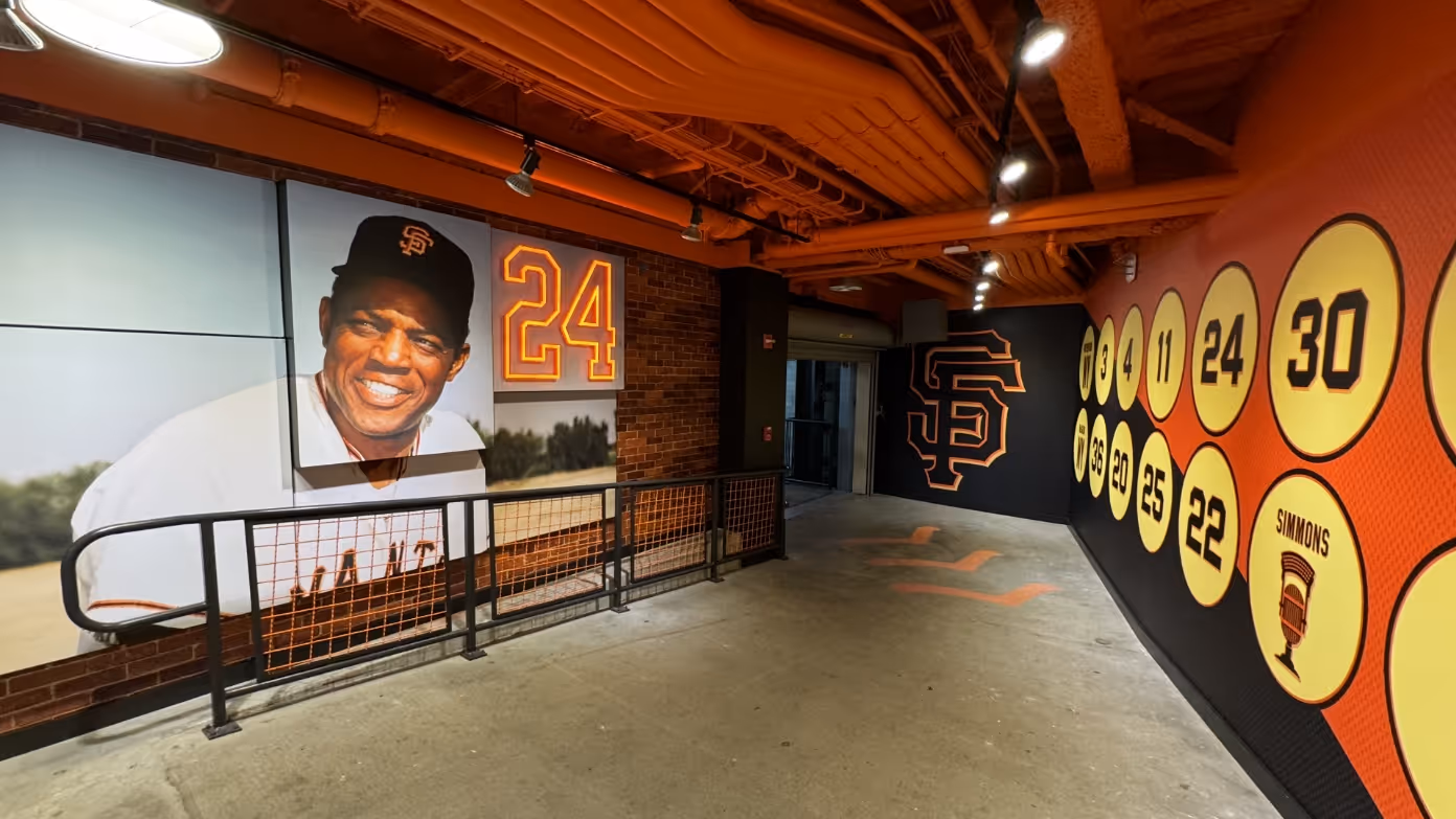
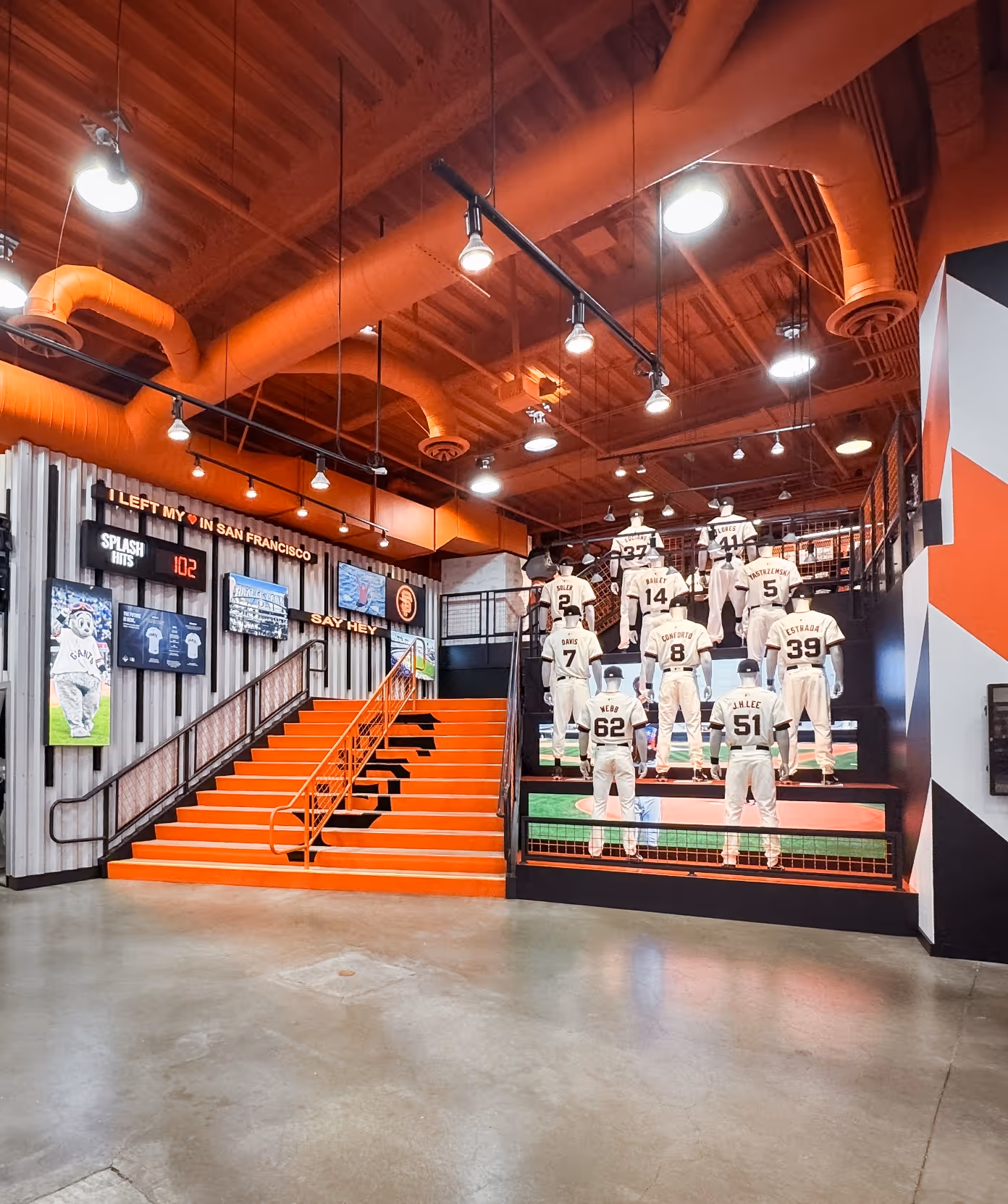
Brand was built into the rhythm of the space rather than treated as a separate layer. Championship year display towers, for example, worked as merchandising, wayfinding and Giants storytelling, while staying flexible enough to refresh season to season.

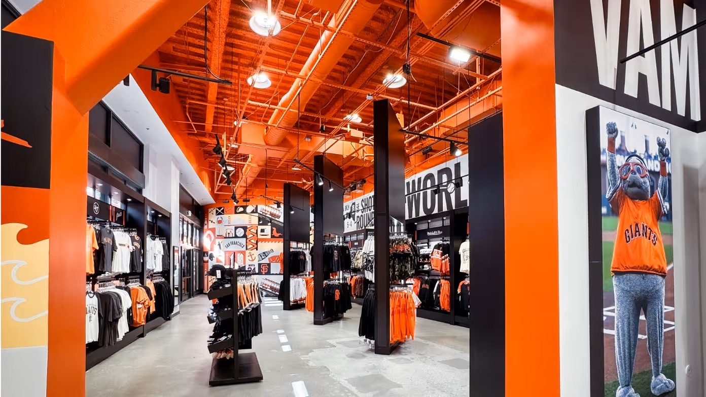

Storytelling layer
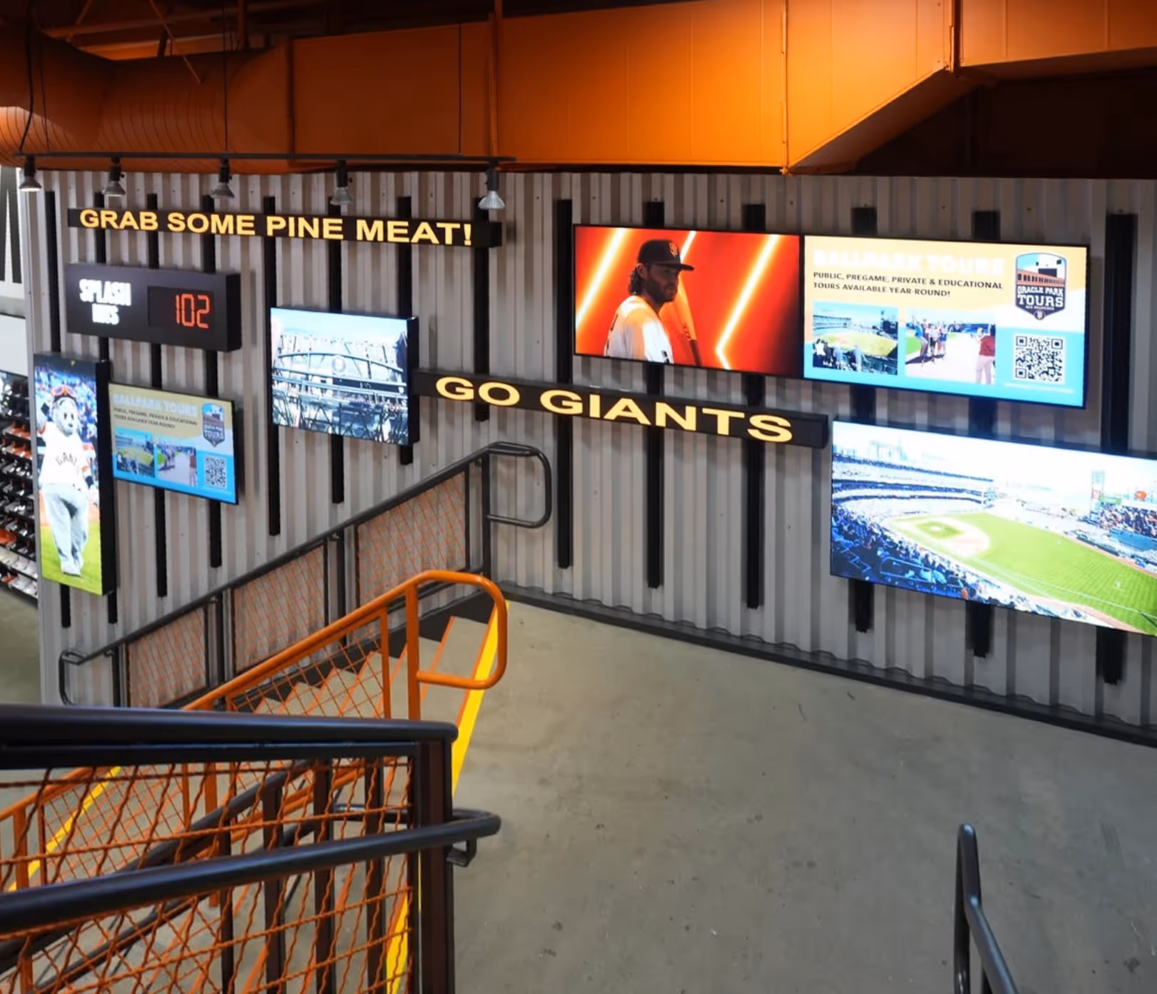
Storytelling was edited around pace. Instead of heavy interactive features that would stop people in the wrong places, we used lighter cues that could be understood in motion, including live radio, video, iconic moments, in-bowl sound and a Splash Hits counter.
That kept the store connected to the Giants without turning brand moments into bottlenecks on gamedays.

Outcomes
The store shifted from a space staff had to actively manage to one the layout could support more naturally.During peak demand, movement became more predictable, queues were managed before they built inside the store, and dwell happened where it added retail value rather than friction.
The modular system also gave the Giants more flexibility for seasonal refreshes, product takeovers and high-demand launches, including the 2025 City Connect uniform, without reworking the core experience.

Decisions & Reflection
Some strong visual ideas were left out because they would not survive real gameday conditions. If a feature slowed movement, created confusion or needed staff to make it work, it was the wrong idea.
The lesson was that brand in a live venue has to do more than look good. It has to support behaviour. In this case, the strongest solution was not the most visible one, but the system that let retail, circulation and Giants identity work together when the store was under pressure.