About
Oracle Park is a 42,000-seater stadium and home of the San Francisco Giants. Over time, fan areas, premium spaces, concessions and event formats had been added, but the venue’s wayfinding had grown in fragments rather than as one connected experience.
Challenge
The ballpark needed a scalable universal identity system that could work across arrival, circulation, premium/ corporate, concessions, and different event modes. Without a shared framework and brand expression could not scale consistently across the ballpark.
Outcome
The work created a stadium-wide framework for hierarchy, terminology, iconography, materials, templates and governance. It gave the Giants a clearer system for fan navigation, partner integration, CapEx upgrades, remodeled spaces and future venue improvements.
Context + Mandate
Since opening in 2000, Oracle Park had changed significantly. New fan areas, premium spaces, concessions and non-baseball events had been added over time, but the wayfinding system had not kept pace.
It had grown in pieces, without a clear standard for how information should work across the ballpark. This created an inconsistent hierarchy, visual clutter at key decision points and congestion during peak periods.
These were not cosmetic issues. They affected how fans moved, how staff supported the experience and how the venue performed on game days.


The Problem
Fans struggled to navigate the stadium, but the issue went deeper than legibility. Signage had been added to solve local problems, which meant brand, hierarchy and terminology varied from area to area. The result was a venue that became harder to read across different levels, ticket types and event modes.
The challenge was to create a coherent spatial language for how information, identity and audience flow worked across the stadium.

My role
I led the experience and system design for wayfinding across Oracle Park, working with internal teams and specialist environmental design partners.
When I joined the project, early work had established a visual direction for one level of the venue. It solved part of the problem, but it did not give the Giants a system they could repeat across the ballpark.
I pushed to reframe the project from level-by-level signage updates into a venue-wide framework.


Constraints + Trade-offs
The stadium remained open throughout, so the work had to happen around games and events. The system also had to work with the existing architecture, respect the character of the ballpark and flex across baseball, concerts, premium spaces and partner needs.
That meant prioritising clear hierarchy, adaptable components and consistent rules over bespoke fixes for individual areas.
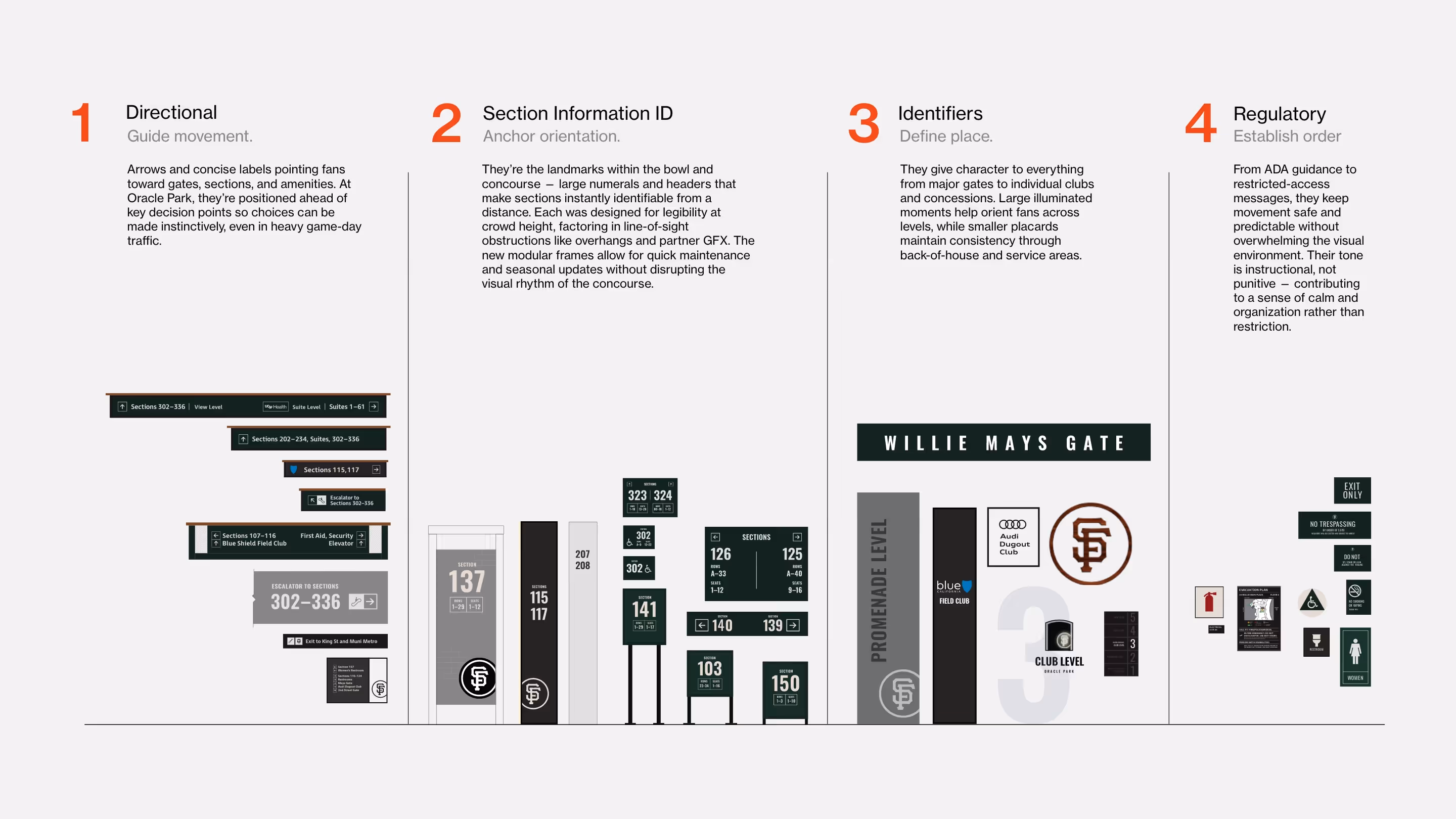
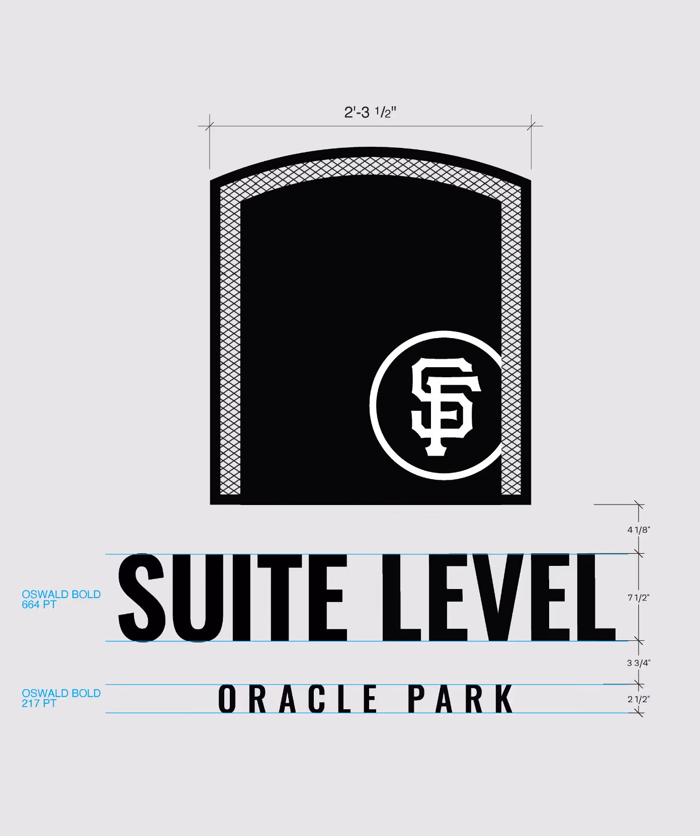
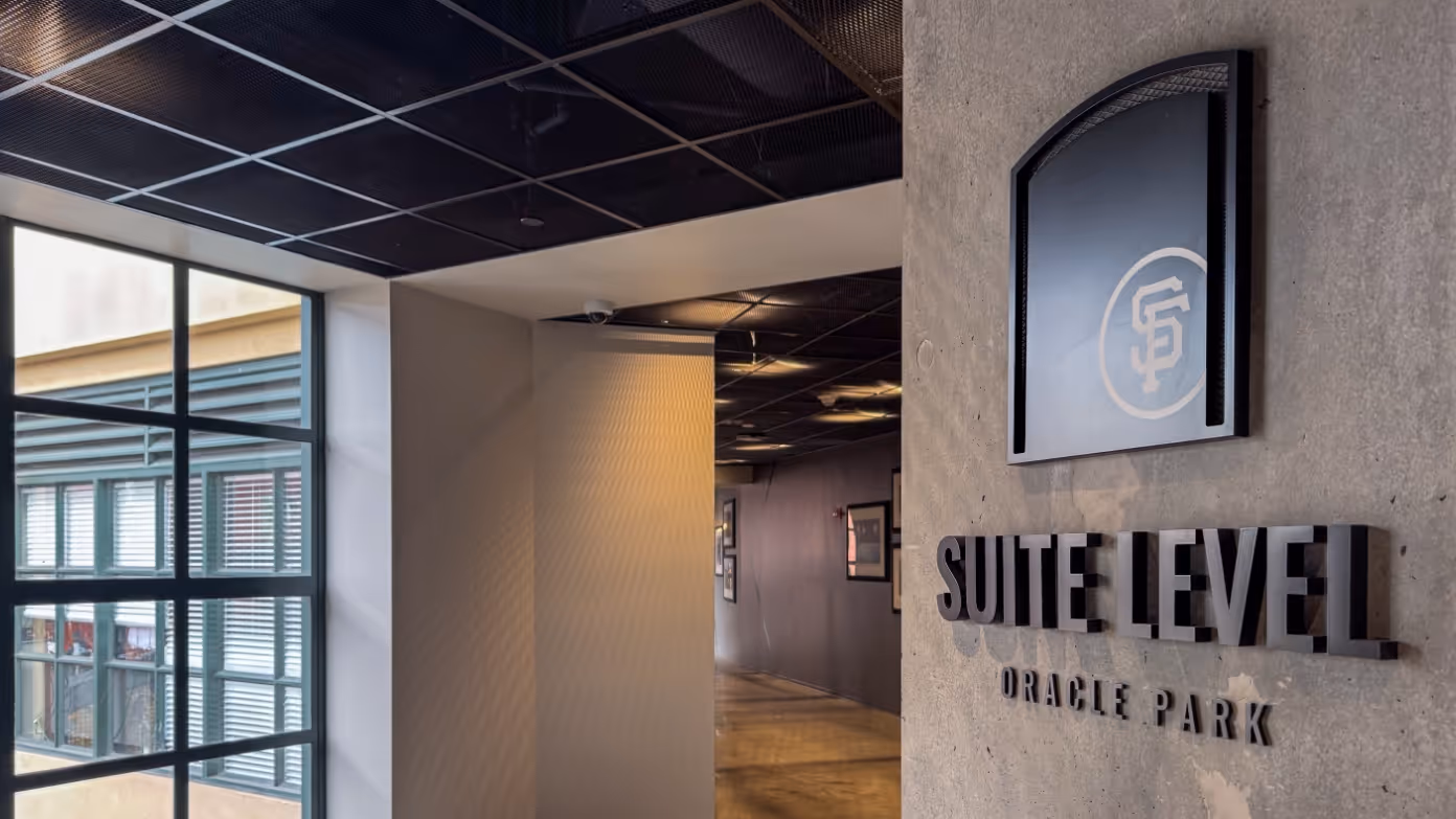
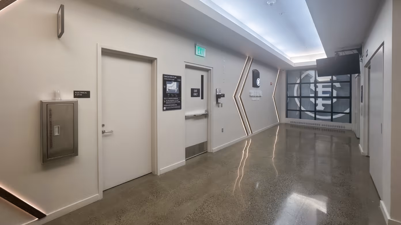
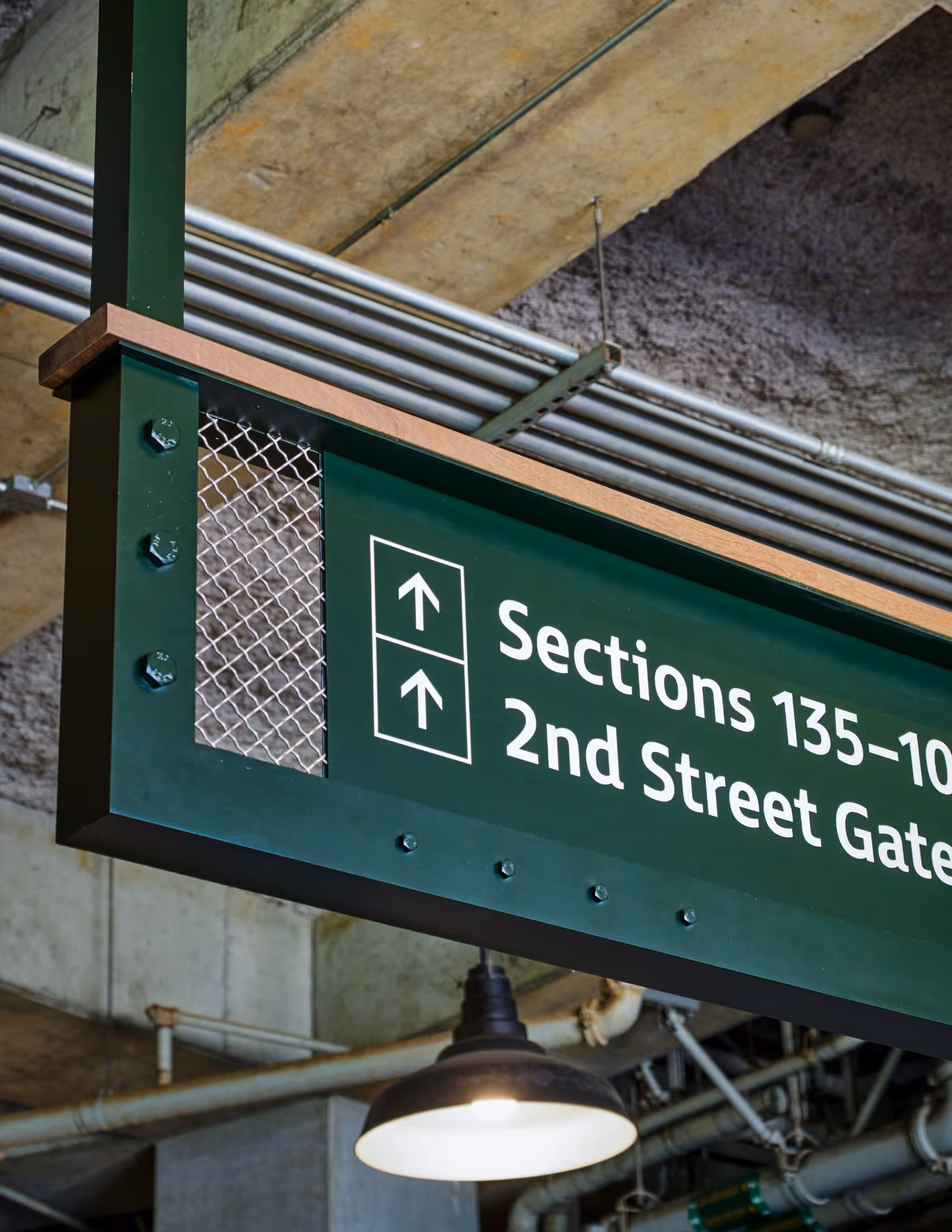
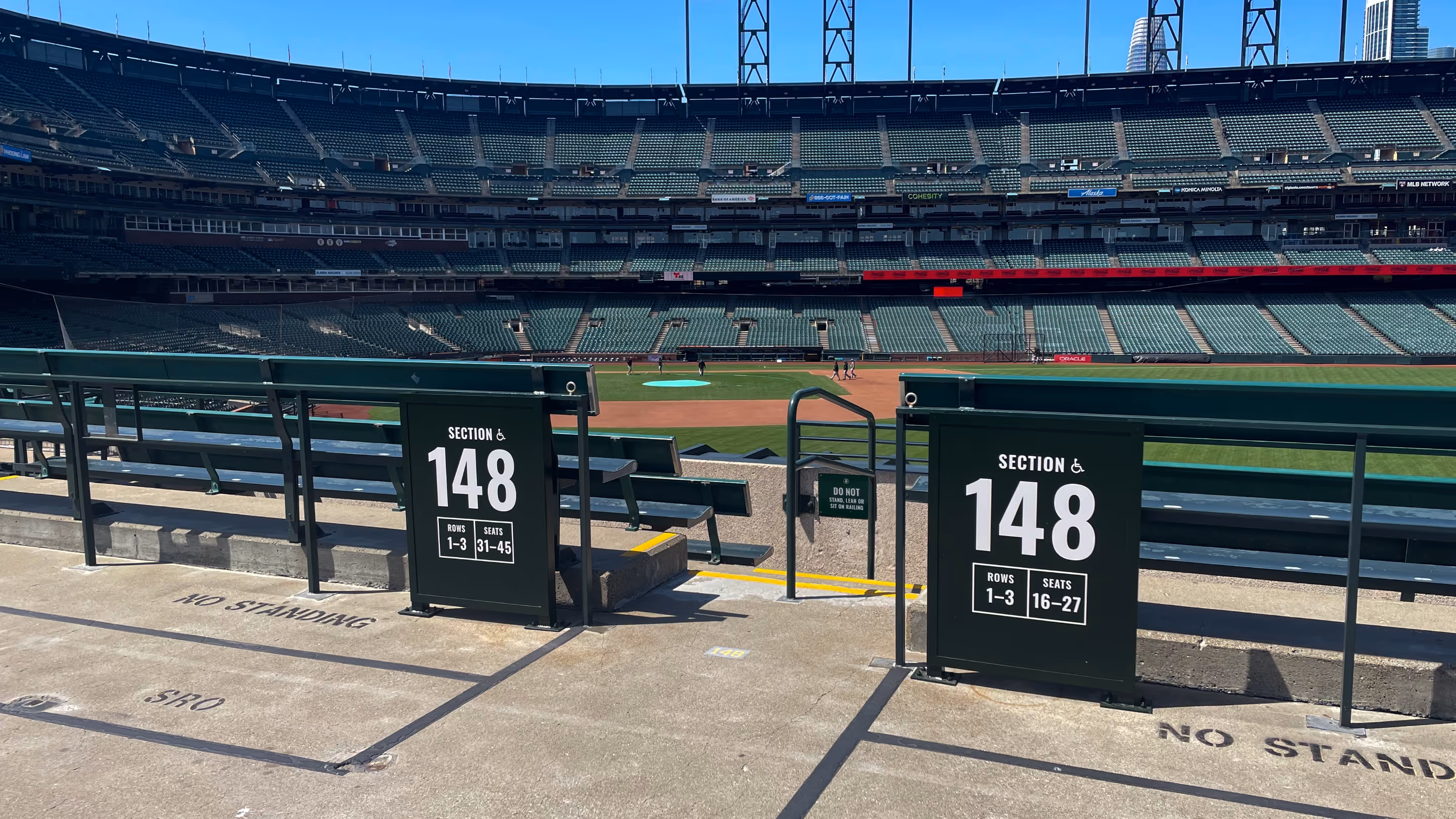
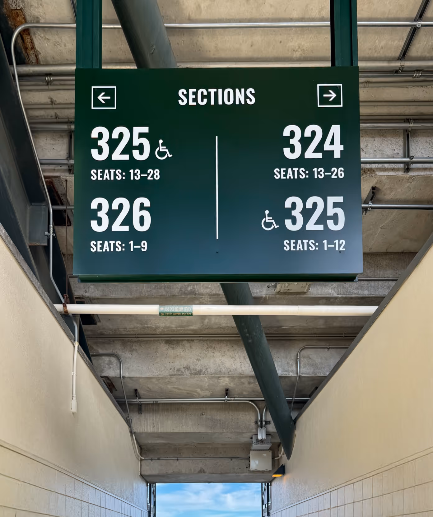
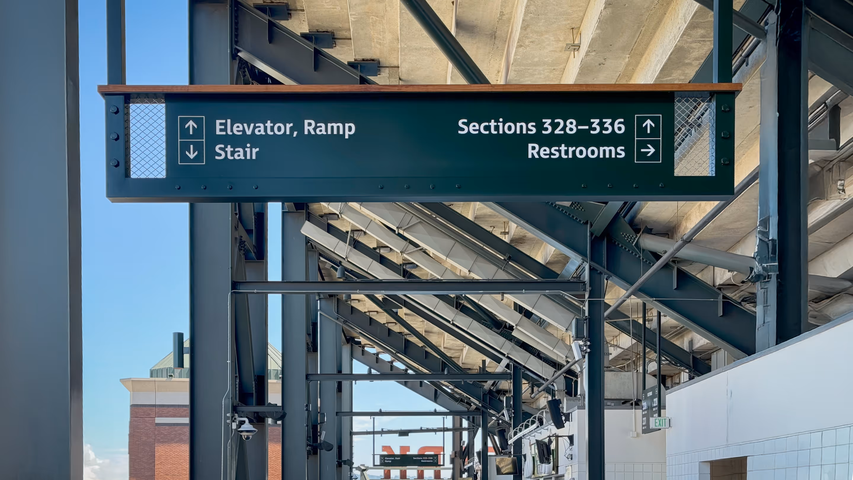
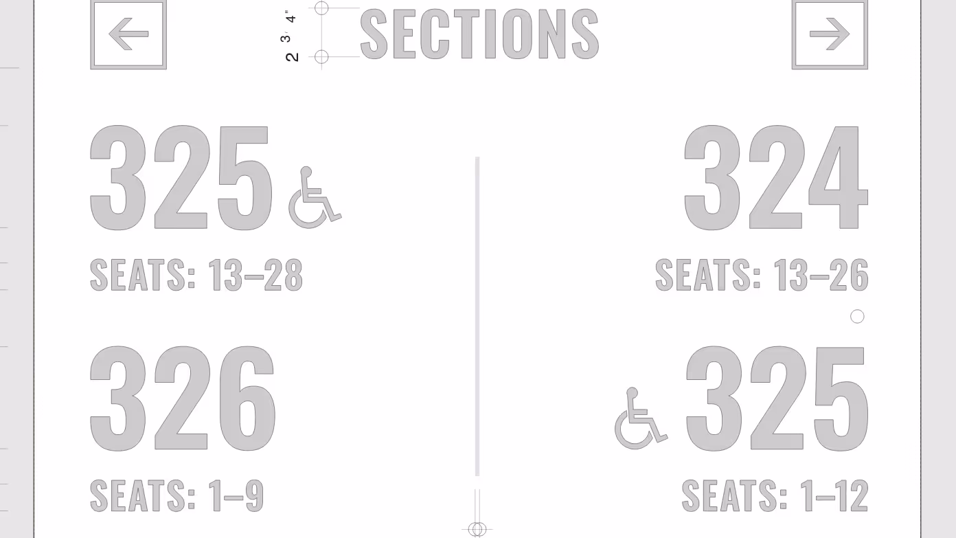
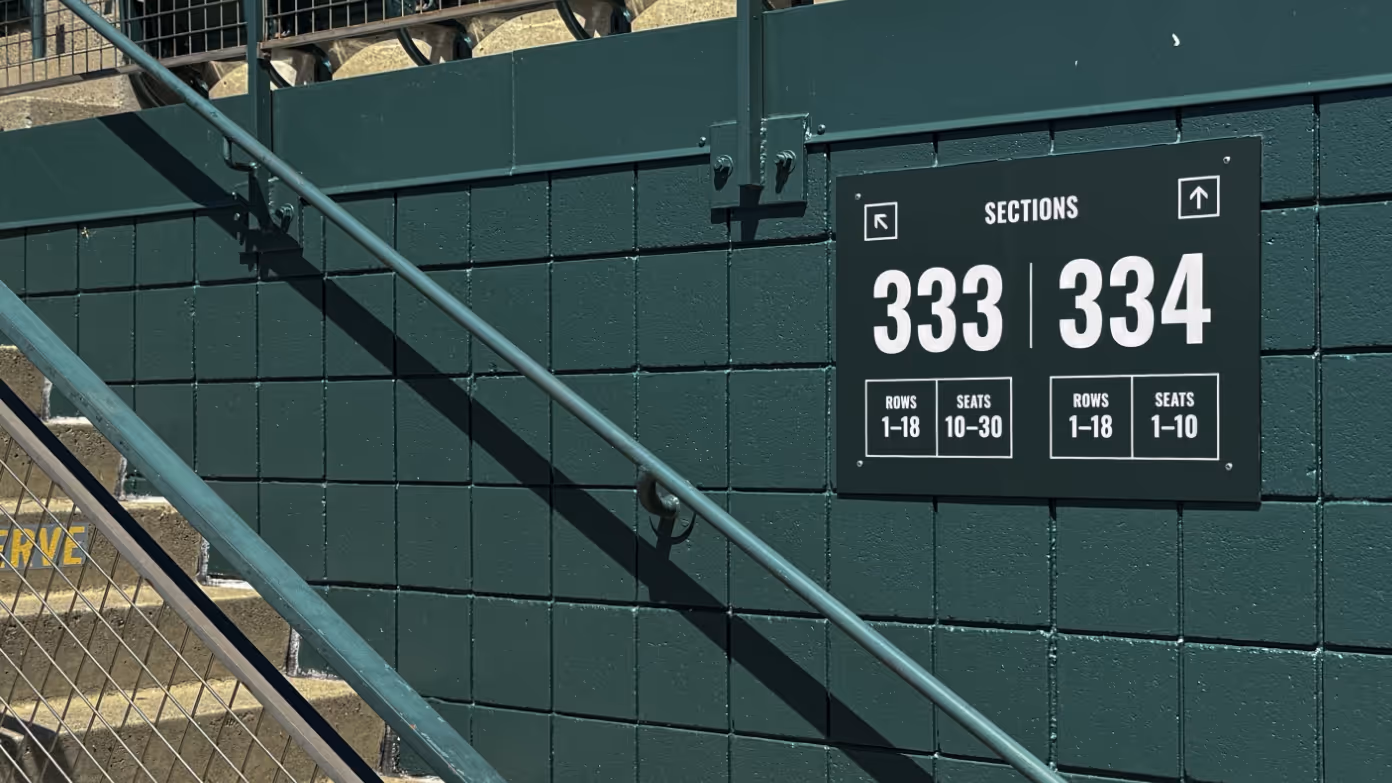
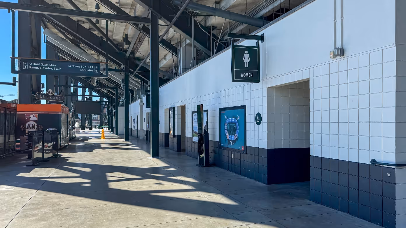
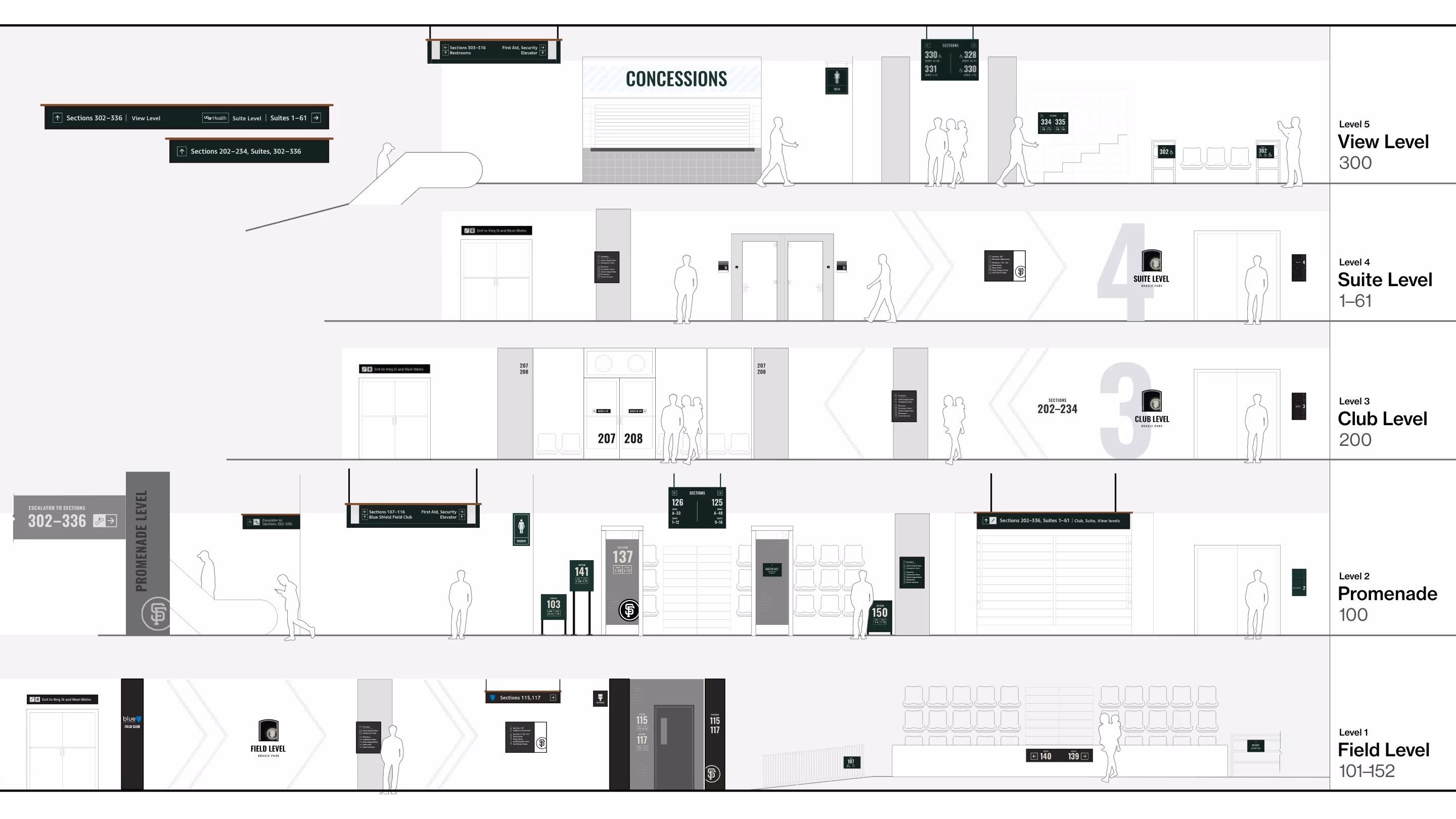
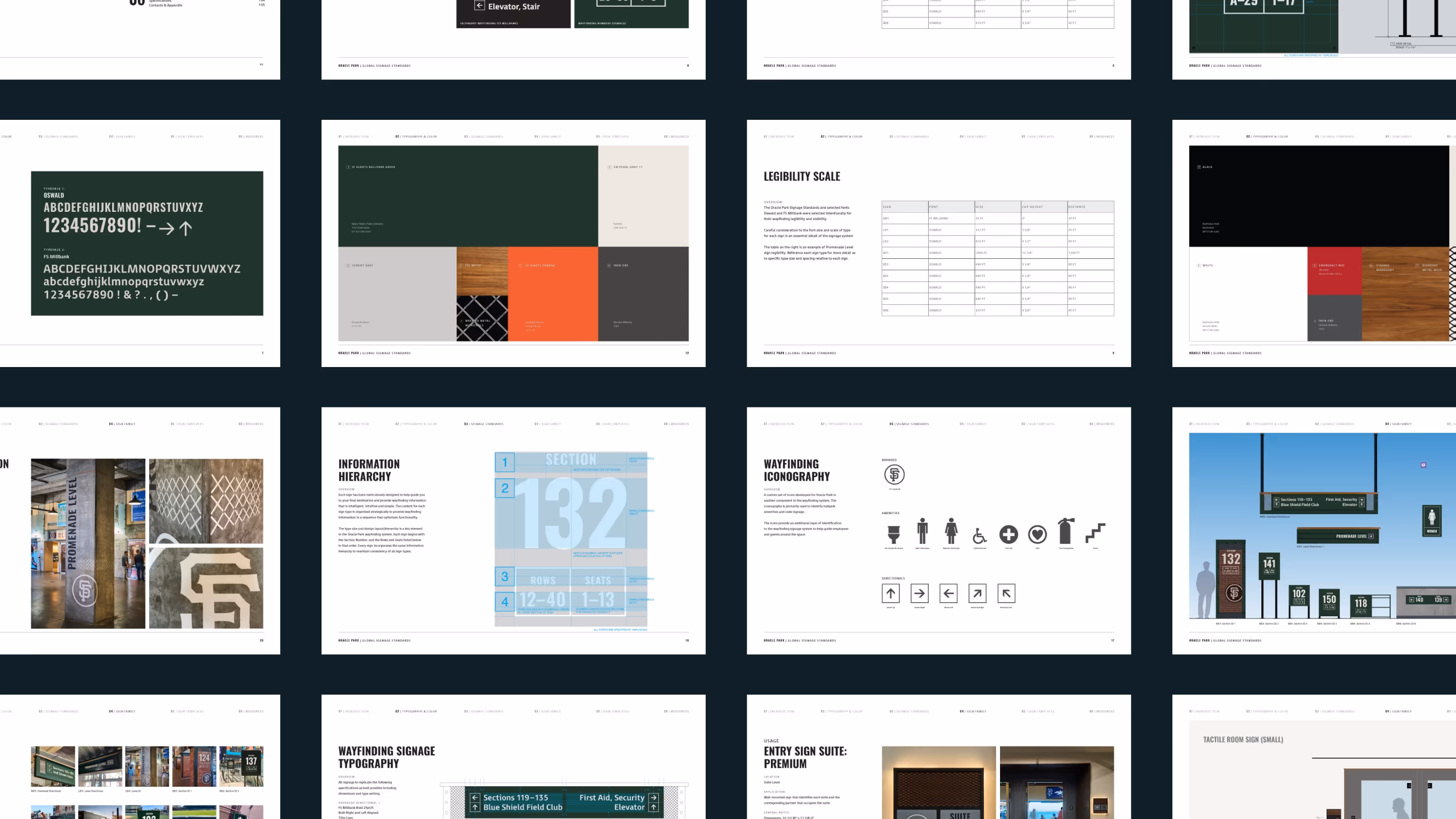
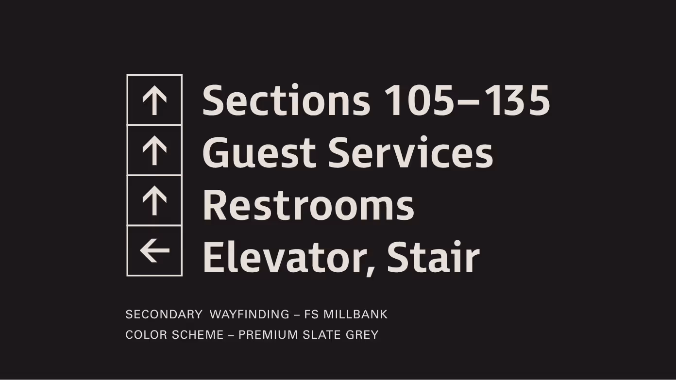
System approach
The framework defined how venue information should be organised, displayed and updated over time. It covered hierarchy, templates and rules for future additions, giving the Giants a clearer way to manage wayfinding and brand expression as Oracle Park continued to evolve.
To make it usable beyond the initial rollout, we worked with delivery partners to produce a signage standards manual, creating a single reference point for future teams and vendors.


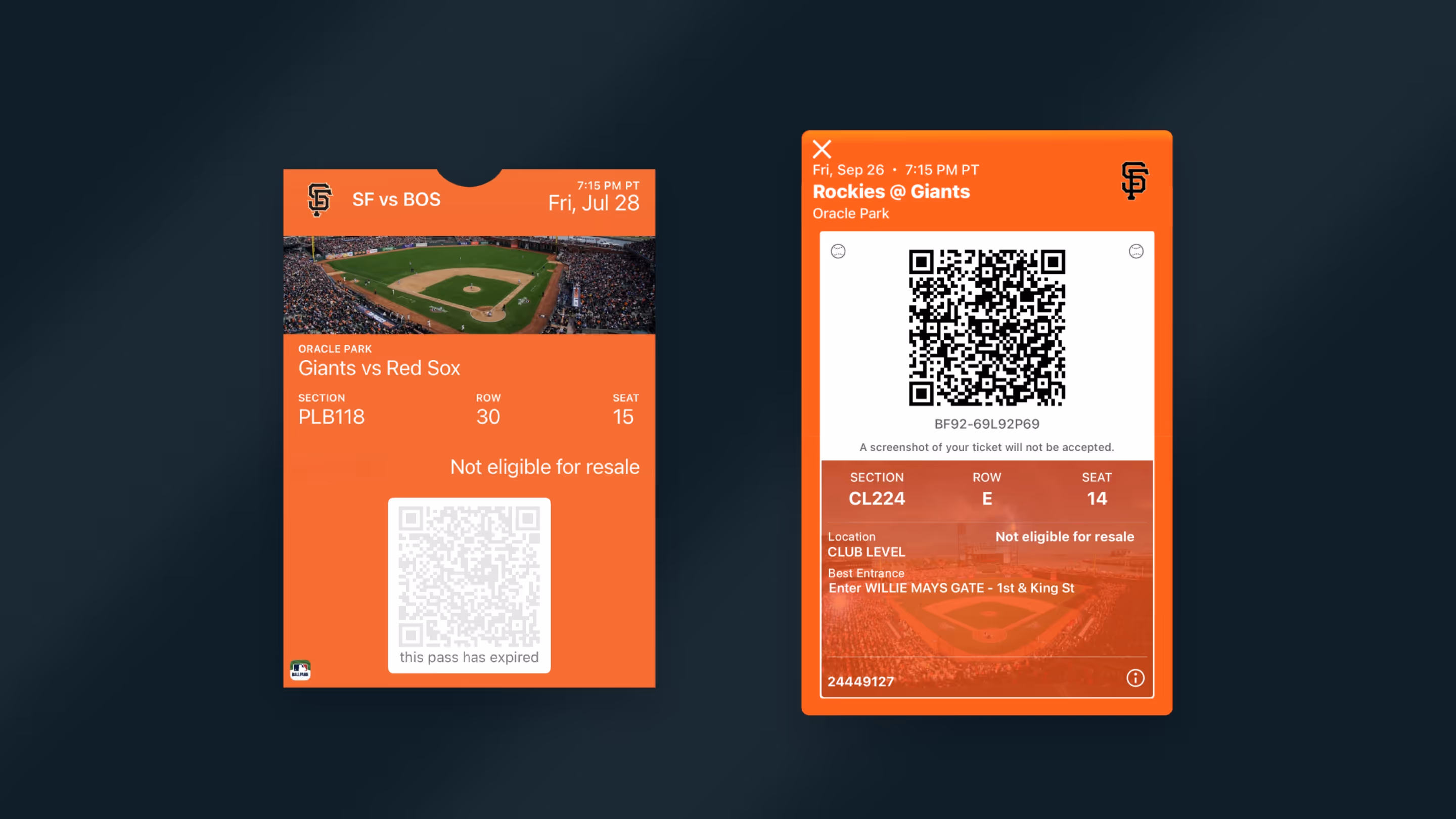
Extending to digital entry
Nearly 80% of fans entered through just two of the four gates, creating congestion outside and inside the stadium. Fans were often using the gates they knew, rather than the best gate for their seat. To shift that behaviour earlier, we proposed adding a recommended gate directly to digital tickets.
The approach was tested with single-game ticket holders first, then scaled stadium-wide once behaviour started to change.
Outcomes + Impact
This gave Oracle Park a clear experience framework for how navigation, identity and venue information could work across the ballpark. It improved fan movement during peak periods, reduced visual inconsistencies, and helped staff manage circulation with less manual intervention.
More importantly, it gave the Giants a system they could make decisions from. The framework could flex across premium spaces, partner needs, ticket products and non-baseball events, giving future upgrades and developments a shared logic.